


Typografische Begriffe und Definitionen.

From alternates to X-height, this list of typography terms and definitions covers just about everything you’d want to know about fonts and typography.
Das Projekt „Fonts for Good“ von Fontsmith (jetzt Teil von Monotype Studio) und M&C Saatchi hauchte den verfallenen Schildern des Londoner Viertels Soho als Font-Sammlung neues Leben ein, um Geld für Obdachlose in der britischen Hauptstadt zu sammeln.
Das erste variable Logo der Welt – entwickelt für WPP.
In einem innovativen und dynamischen Umgang mit dem neuen Variable-Font-Format haben Fontsmith (inzwischen Teil des Monotype Studios) und die niederländische Markenagentur VBAT eine reaktionsfähige Logo-Schrift für den neuen WPP-Campus in Amsterdam entwickelt – ein Logo, das sich je nach Interaktion und Tageszeit verändert. Während sich Menschen durch den Raum bewegen, verändern sich auch die Buchstabenformen.
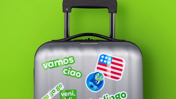
Eine maßgeschneiderte Schrift (mit Flügeln) für Duolingo.
Inspiriert vom ikonischen Eulen-Maskottchen Duo begann die Agentur Johnson Banks damit, zu erforschen, wie sich die charakteristischen Formen des Maskottchens in die Typografie übertragen lassen. Gemeinsam entwickelten wir die Idee weiter: Wie lässt sich die Form und Dynamik eines Eulenflügels in eine einzigartige Markenschrift übersetzen?
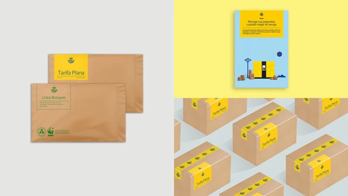
Spaniens nationaler Postdienst Correos blickt auf eine mehr als 350-jährige Geschichte zurück. Gemeinsam mit der Markenagentur Summa haben wir eine exklusive Schrift für Correos entwickelt. Ihr Name: Cartero (Postbote), eine Hommage an die Menschen, die seit jeher das Herz und Gesicht des Unternehmens sind.
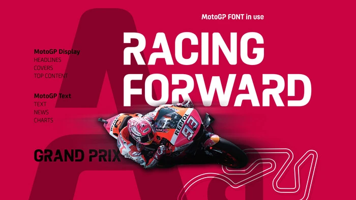
Eine neue exklusive Schriftfamilie für MotoGP™, die Königsklasse des Motorradrennsports.
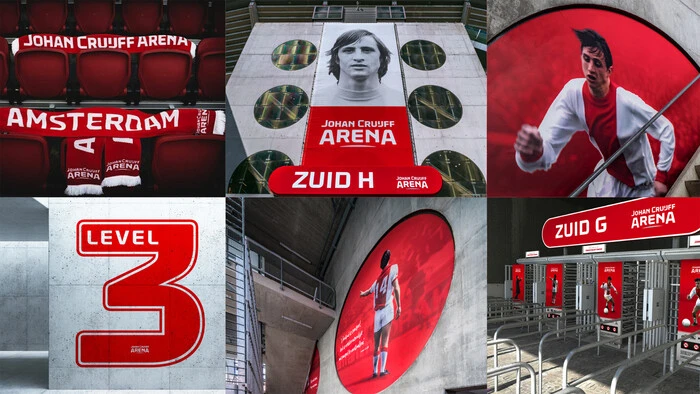
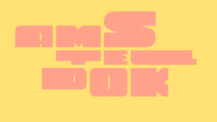
Eine speziell entwickelte Schrift für die „Johan Cruijff ArenA“ in Amsterdam und ein Schriftzug, der symbolisiert, dass diese Arena „The Home of Legends“ ist.
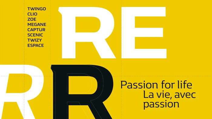
Zwei speziell für Renault entwickelte Schriften: eine einzigartige Semi-Serif und eine fett-kursive Versalschrift.

H &M benötigte eine individuelle Schriftart, die bei jeder Kommunikation gut aussieht – von großformatigen Grafiken in den Läden bis hin zu kleineren Schriftarten für die Website und saisonale Lookbooks. Monotype und The Studio arbeiteten bei Design und Entwicklung der exklusiven Schriftart HM Amperserif für die Marke zusammen.

Der Hearst Verlag wurde 1887 gegründet und ist mit über 30 TV-Sendern und mehr als 300 Magazinen, darunter Cosmopolitan, Elle und Harper’s Bazaar heute eine der angesehensten Medieninstitutionen der USA. Alteingesessene Unternehmen wie Hearst bleiben erfolgreich, wenn sie es nicht versäumen sich anzupassen und kontinuierlich zu wachsen. In diesem Fall durch eine flexible Unternehmenslizenz.

Der neue Markenauftritt von Monotype muss gleichermaßen konsistent und überzeugend sein, so wie wir das für unsere Kunden anstreben. Nur wo geht die Reise hin, wenn man als Schriftenhaus Zehntausende von Fonts zur Auswahl hat, um diverse Produkte und Dienstleistungen unter einen Hut zu bringen?


Inspiriert von der Tradition. Entwickelt für modernes Design.
Macklin ist inspiriert von der Zeit, als die Schrift von den Seiten der Bücher auf Großplakate und Anzeigen drängte. Mit einer klaren Weiterentwicklung gegenüber ihren typografischen Vorbildern ist die Superfamilie Macklin mit ihren scharfen und doch eleganten Formen bestens geeignet für zeitgenössisches und modernes Design.

Die Wahrheit ist, dass es keinen „falschen“ Weg gibt, sich mit Helvetica zu beschäftigen. Man kann sie lieben oder hassen, sie für alles verwenden oder gar nicht.

„Hinter den Zeichen“ ist eine Serie von Designer-Interviews, in der die Schöpferinnen und Schöpfer der Fonts vorgestellt werden, die wir lieben und gerne benutzen.

Die Kreativen sind die Hauptnutzer der Fonts, doch die Lizenzierung erfolgt in einer anderen Abteilung. Das nervt und erzeugt bürokratischen Stress. Doch es geht auch anders.
From alternates to X-height, this list of typography terms and definitions covers just about everything you’d want to know about fonts and typography.