A bespoke handwriting typeface for Sir Quentin Blake.
Monotype worked with noted illustrator Sir Quentin Blake and his team to recreate his handwriting as a bespoke typeface.
Background
If there’s one word that comes to mind when thinking of Sir Quentin Blake’s work, it’s joy. As one of the world’s most eminent and well-loved illustrators, his art — whether found in his famous collaborations with Roald Dahl, in his own range of award-winning books, or hanging in exhibition halls — has helped hundreds of characters leap from the page and into the hearts of children (and big children) the world over.
His playful style is particularly evident in his handwriting. With its distinctive forms and irregular placement it is very, undeniably, his, and is often just as much in demand as his illustrations, whether it’s for the cover of a book, publication, or other commercial work. In addition, he’s a long-standing supporter of many charities and projects and is regularly asked to write out names or phrases to be displayed as a sign of his support. He is, not surprisingly, a busy man.
Toshi Omagari. Senior Type Designer, Monotype.
A typeface in the style of his writing had been created for use in publishing some years ago but, as time went by, its limitations had become more noticeable. Blake and his team looked to Monotype to create a new typeface that could help lessen the weight of demand on his time and meet a wider variety of needs.
The challenge
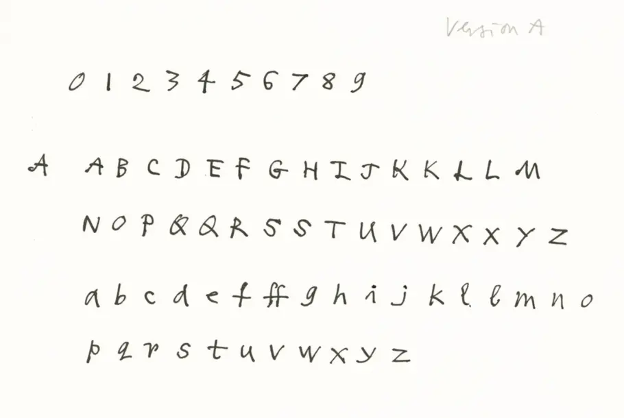
Take a look at your handwriting and you’ll be able to spot the details that make it uniquely yours, whether it’s the arc of a nine, a sharp cross on a t, or a loop on a g. For the new typeface to be a success it would need to mimic Blake’s own idiosyncrasies: the small and varying lowercase height, the unpredictable stroke thickness, the exaggerated crossbars and tails. It would need to be flexible too, capturing the same rhythm and spacing that he would include when laying out a piece of lettering by hand. And it would need to accommodate a demand for international languages to help meet more time-consuming challenges: “Requests for different languages can be quite difficult if he’s not familiar with them,” explains Liz Williams, Blake’s archivist. “He has to consider each letter carefully to make sure it’s right and that can detract from the natural flow.”
The brief was simple, if challenging: to create a typeface that reflects the unique form of Blake’s writing in an authentic, natural way; not just the shape of the letters but the way he chooses to place them.
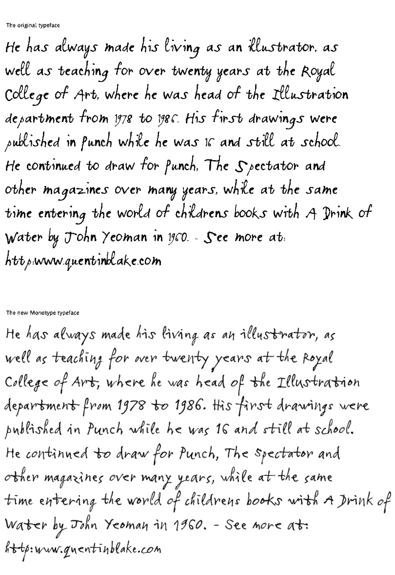
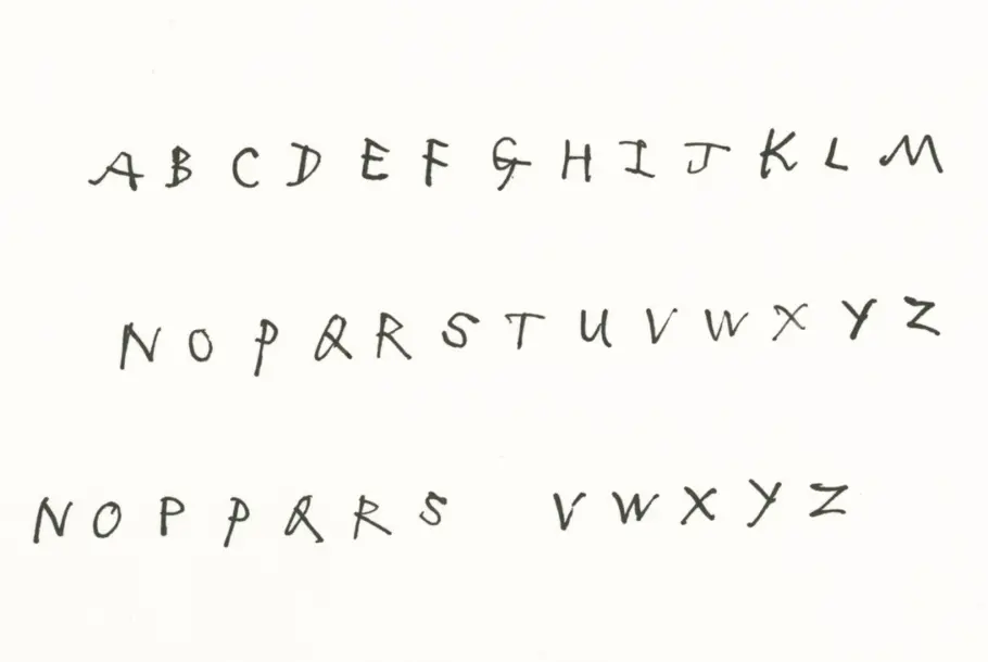
Quentin’s original handwriting font, and the new Monotype version.
The solution
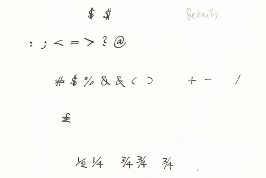
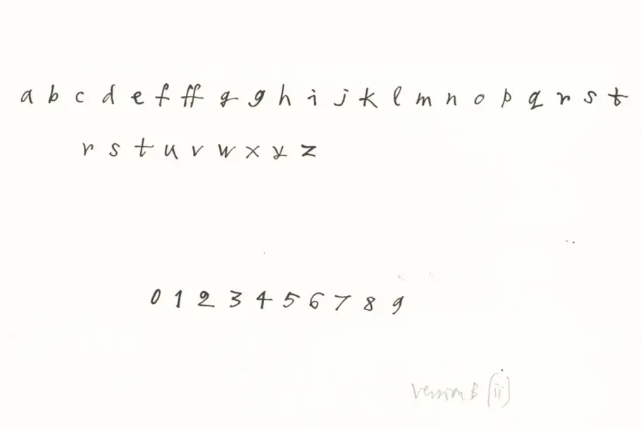
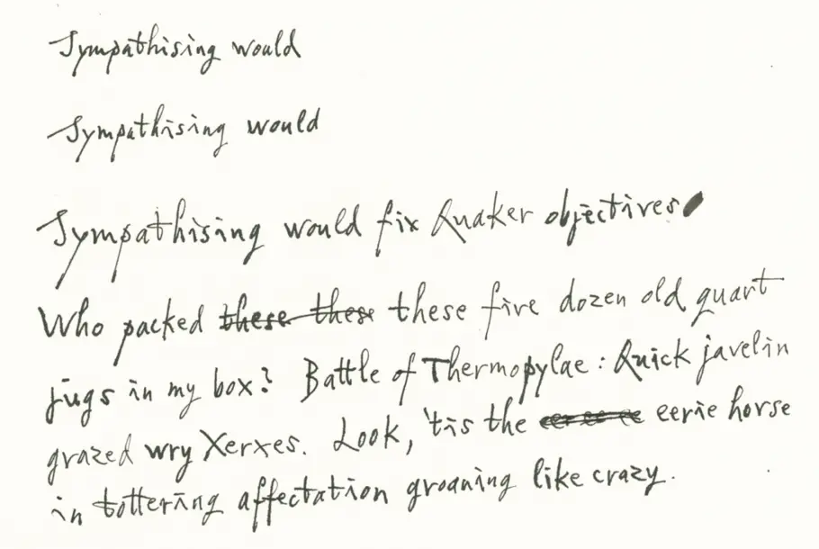
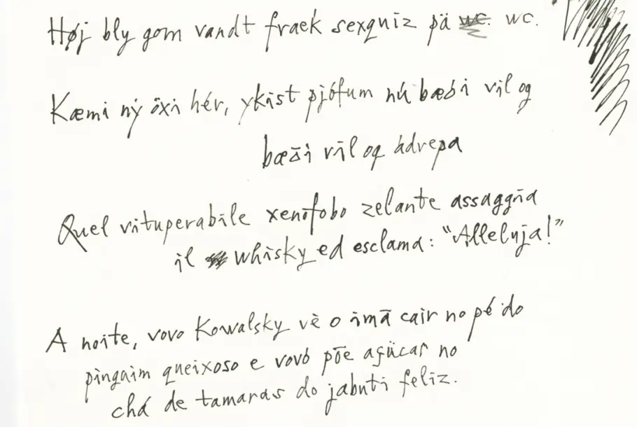
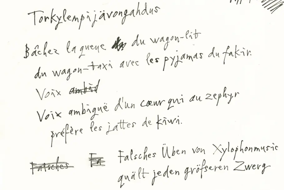
Starting with Blake’s original inkings, Monotype’s type designer Toshi Omagari set about selecting and redrawing individual letters, numbers and symbols, but it soon became apparent that using this technique lost some of the flow of the original handwriting. Toshi went back to Blake for more samples, this time written in sentences and pangrams.
From these, he selected four subtly different alternates for each character that, combined, would make the text look random enough to look authentic while keeping the glyph set manageable. The importance was in finding the balance between variety and regularity: “Without variants, handwriting fonts run the risk of looking unnatural; too many and the process can become unmanageable,” explains Toshi. “Quentin’s writing is anything but regular but it’s not totally random either. There’s something you can find in it to say that it’s his — just as no single cloud is identical to another and has no definite shape, when you find one in the sky you can still tell it’s a cloud.”
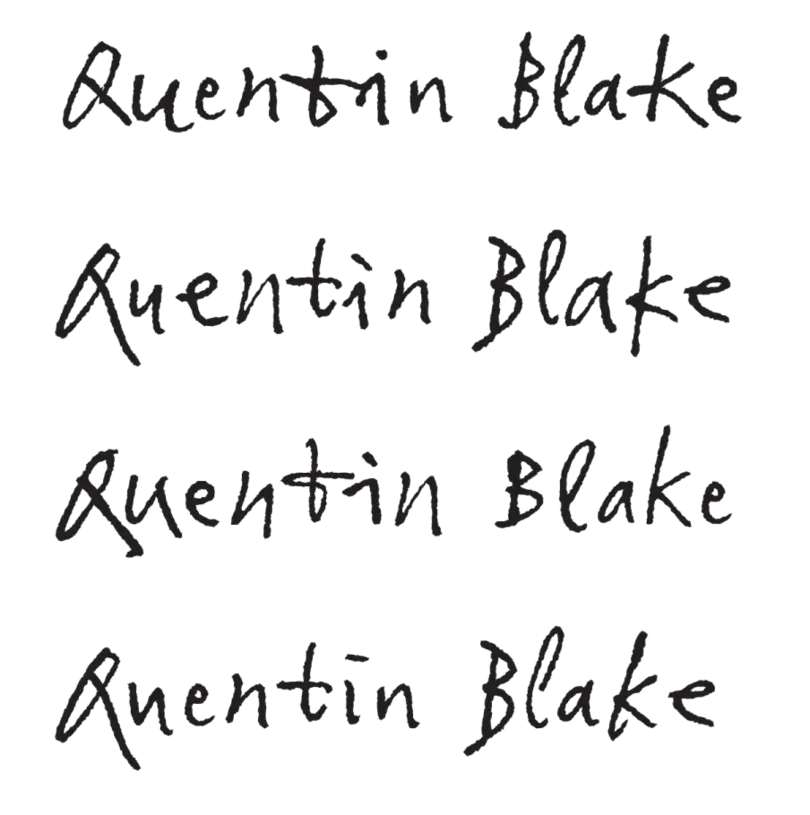
Examples of Quentin Blake’s name generated in various ways using subtly different alternates.
Each of the alternate characters was selected on the basis of size, similarity and clarity: not being too large or small, not too similar, the ink not too smudged. Where needed, additional glyphs for characters that couldn’t be captured consistently, mainly non-English letters and uncommon symbols that occur infrequently, were drawn in Blake’s style. The overall appearance needed to be natural: “I didn’t want anything to look too unique, especially in the vowels which appear more frequently, because people would notice the ones that stand out, notice them repeated, and realise it’s a font,” adds Toshi. “It had to look random, and it had to hide the fact that it’s not his actual handwriting.”
This same principle applied when it came to kerning, with Toshi taking care not to regularize spacing too much in order to maintain the writing’s characteristic irregularities. This was no mean feat; four sets of variants meant each glyph was first kerned against the others in its own set, and then against the glyphs in the other sets (in total, the kerning was tested in nearly 25 permutations). Any ligatures that featured in Blake’s writing were also carefully balanced, while letters like t, whose trailing, longer bars were more difficult to place, were given a little more adjustment to make sure they touched nicely against neighboring characters.
The finished typeface doesn’t just look like Sir Quentin Blake’s writing, it acts like it too. As you type a letter, each one of the four variants appears in an order that avoids repetition of the same shape, making it appear random. For print use, a roughness filter has been applied to give an authentic handwritten finish, while the web version has a cleaner outline and smaller character set to achieve a reduced file size. The addition of diacritical characters to cover Latin alphabets means it’s ready to take on broader challenges.
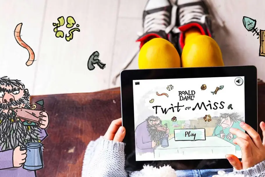
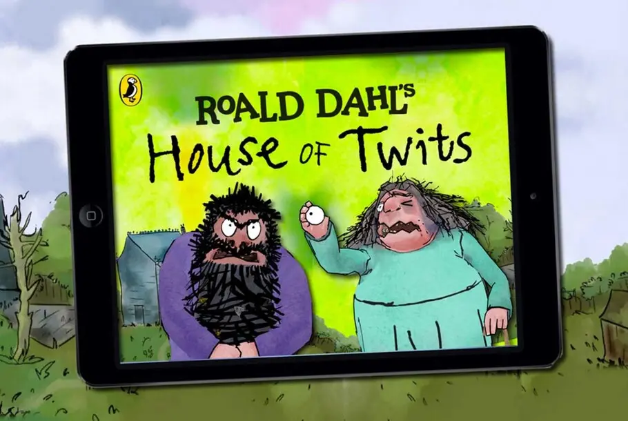
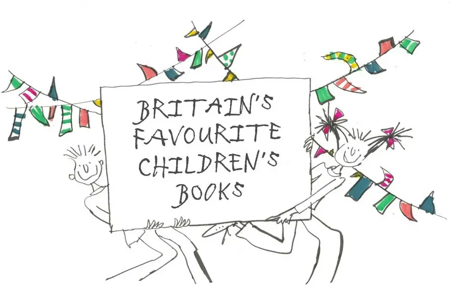
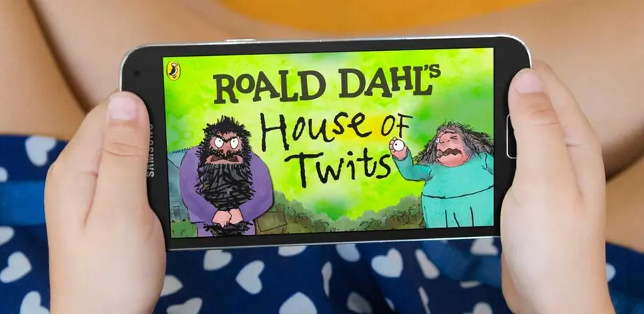
His team is hopeful the typeface will meet any needs and ideas that come up now and in the future. It’s already been used in an app called Twit or Miss, on the television program Britain’s Favourite Children’s Books, and will soon be found on a series of new mugs and on the Quentin Blake website. In the long term they’re optimistic that it will have uses within screen and stage environments as well as for exhibition titles, captions and graphics. It’s an integral part in helping ensure his handwriting continues to be enjoyed for years to come.
For now it allows Blake more flexibility and, importantly, he has a typeface that he’s happy with, as he explains: “I have been impressed by the way that Monotype interpreted my handwriting in various forms, so that it has the distinctive characteristics but at the same time is eminently usable as a typeface in any number of situations.”
For enquiries to license this Quentin Blake custom typeface please contact Olivia Maidment at United Agents. For any alternative custom typeface enquiries, please contact the Monotype team directly.
