8 font fails to avoid when building your brand.

When you’re a designer, it’s thrilling to create a new brand or update an existing one. You get to be creative! Strategic! You get a chance to make your mark!
In addition to deciding on a color palette and imagery style, you get to choose foundational typefaces for your brand. But font selection should not be based on looks alone.
No matter how attractive or distinctive your font choices are, if they don’t work well, you’ll regret them. They’ll not only frustrate your colleagues, but force them to find workarounds and turn to unsanctioned typefaces to get the job done. The next thing you know, you’ll have typographic inconsistencies diluting the beautiful brand you worked so hard to build. Your audience will notice, too, degrading your brand’s sense of quality and damaging the trust you’re trying to build.
Avoid all that. Read on and learn what to watch out for.
Mistake #1: Forgetting about the future.
Remember: You’re not just designing a brand for today. You’re designing a brand that needs to last for years. Contemplate all the places your brand might exist in the future. Ask yourself:
- What regions of the world might this company expand into?
- What audiences might this brand need to speak to?
- What media might this typography need to work in?
- What sort of information might this typeface need to convey?
The more you can anticipate, the more effective you’ll be at choosing the right typeface.
Mistake #2: Overlooking other languages.
It’s easy to focus exclusively on your company’s primary language. But you want to give thought to all the languages your typeface will need to express in the future. Consider not only your brand’s geographical expansion, but the languages your current and future customers and employees might use.
If you choose the wrong typeface, crucial characters, diacritics, and scripts might be missing. And the look and feel that you appreciate might not carry over to other languages.
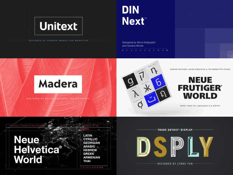
If you believe your brand will need to communicate in many different languages, consider choosing a well-developed type family. For example, the typeface SST supports 93 different languages, and Avenir Next World and Neue Frutiger® World each support more than 150.
Mistake #3: Settling for an inadequate character set.
Most of the time, you only need lower- and uppercase letters and a handful of “regular” punctuation marks. But a typeface needs to include so much more to adequately support a brand. Fractions. Diacritics. Ligatures. A variety of punctuation and currency symbols.
Take the time to assess the character set of any typeface you’re considering to ensure that it can handle any job that might come its way.
Mistake #4: Forgoing functionality.
These days, fonts need to perform well in all types of devices, browsers, programs, and operating systems. Make sure that your brand’s typefaces meet all the highest standards of performance across the board.
One good indication about a font’s performance is the OpenType format. OpenType fonts, thanks to their file structure, offer superior functionality. They provide cross-platform compatibility and features like automatic ligatures, alternate glyphs, and expansive character sets.
Another important consideration for web font functionality is load speed. You want to choose fonts that will appear quickly when called upon. Web development tools like GiftOfSpeed can help you assess load times, and smart coding can maximize efficiency.
Mistake #5: Overlooking tried-and-true typefaces.
It’s easy to be seduced by a shiny brand-new typeface, but often the latest releases are still relatively limited in terms of functionality.
On the other hand, a well-established font family like Gotham or Helvetica Now tends to be more robust. If you’re reluctant to choose something so well known, remember that there are many ways to be expressive and distinctive with a well-developed type family. An extensive variety of weights, widths, styles, and alternate characters can enable you to create a unique look with a classic typeface.
Mistake #6: Not thinking big. (Or small.)
Even if your brand isn’t appearing on highway billboards today, might it need to a few years from now? How would your typeface perform there? Contemplate all the possibilities:
- PowerPoint presentations.
- Smart watch screens.
- Out-of-home advertising like airports and subway stations.
- Trade show booths, banners, and giveaways.
- Mouse type for disclaimers and other footnotes.
If you’re going to use one typeface across the board, make sure that it’s been engineered with optical sizing to ensure it will work well in all instances: text, display, and micro sizes.
You also might want to consider variable fonts. These provide unprecedented versatility, as you can fluidly adjust their weight, width, slant, size, and style to fit the need.
Mistake #7: Not considering your colleagues.
You’re not just selecting a typeface for the company letterhead and business cards. You need to contemplate all the ways various employees—from entry-level to C-suite—will need to use it.
Ask the marketing department about their year-round plans. Talk with folks in finance about their charts, tables, and graphs. Find out what HR needs, from recruitment to retirement. Make sure your font is up to the job.
Mistake #8: Settling for Standard when you ought to go Pro.
You’ll notice that some typeface names have the suffix “Std” (Standard) or “Pro” (Professional) at the end. These two designations are not entirely consistent across all type foundries, but generally, a Pro version will give you:
- OpenType support.
- More languages.
- Additional extras like ligatures, swashes, ornaments, small caps, and icons.
- Alternate options for titling, fractions, numerals, and stylistic sets.
Pro versions deliver more, so they cost more. But depending on your needs, going Pro may be well worth the investment. You’ll get a more robust typography set and the assurance that all your bases are covered.
Choose your type wisely and be happy.
Despite these common branding typography mistakes, if you exercise some caution at the outset of your project, you can avoid a host of problems and ensure that your font choices continue to perform well to maintain your brand for years to come. Simply pay attention to all the font selection considerations mentioned above, and in particular:
- Try to anticipate all the ways your brand typeface might need to perform in the future.
- Talk to stakeholders throughout your company about their needs.
- Rigorously test any typeface contenders.
If you ever have any questions about a font family or need any assistance, just contact us. We love to talk type!
