


Good Type, part 2: Good type has a voice.
If fonts could speak, what would they say? It’s a strange question to ask but essential to consider when faced with thousands of potential designs, and the need to find a font that conveys your message clearly.
Before you even get that far, it’s key to understand that fonts have a powerful, and instant, visual effect on people. They can be used to speak loudly, softly, playfully, seriously, or in any other voice that you can think of. There’s a reason Jim Williams’ quote about type being the “clothes that words wear” is so often repeated, and it’s because the choice of font can manipulate meaning so drastically.
“It’s almost like every time a typeface is used for something new it changes,” says Monotype Director of Product Design Jamie Neely. “That affects brands, and visual movements.”
When fonts are used cleverly, written language can become deceptive. For example, imagine the word “hate” written in a language you don’t understand, but set in a warm and friendly font. Without the understanding of what that word means, your interpretation is instantly colored by the form of the letters. Fonts can reach deep into our amygdala, where human emotions are generated, and make us feel things without any need for language.
For many people, fonts speak to them in an intensely personal way. Fonts are threaded through our lives, playing an integral role in how we interact with our phones, use our roads, find our way around airports, and the list goes on. Even without a deep understanding of how type works, people are aware of how it affects them – for example if the font on their phone changes, or if hospital signage feels unwelcoming.
Fonts are also subject to context. In 1937, Gerry Powell designed Onyx, a Bodoni-esque font that became very popular in the advertising of the 1940s. Fast forward to Seattle of the late 1980s, and this refined piece of type took on an entirely different voice when Nirvana used it on the cover of its ‘Bleach’ album. Onyx undoubtedly spoke in a very different way to the people of the 1940s than it does to music-lovers today.
ITC Benguiat is another example of the power of typographic voice, becoming so popular as the title font for Netflix’s Stranger Things that it’s almost a member of the show’s cast. Title sequence designer Imaginary Forces chose the font to speak in a bygone voice – one that instantly recalled the choose your own adventure books and Stephen King novels of the 1980s. The font is now inextricably bound up with the series, modifying its voice for a generation of pop culture enthusiasts.
“It’s interesting to think about time and context, and its effect on the voice,” says Neely. “I’m sure the 14th century monks of Europe had no clue that their beloved and painstakingly practiced Gothic lettering would be used one day in Nazi propaganda, sub-genres of tattoos, and Snoop Dogg records.”
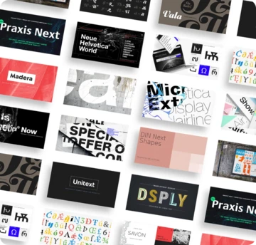
Choosing fonts is a nuanced process, and one that has to consider the way a typeface communicates as well as how the context of past and present influences the reader’s perspective. Remember, the design you choose is the voice your brand speaks in.
Stay tuned for more from the Good Type series. Video recorded live at Adobe Max 2017.


