Right place, right time: The complicated legacy of Helvetica, one of the world’s most iconic typefaces.
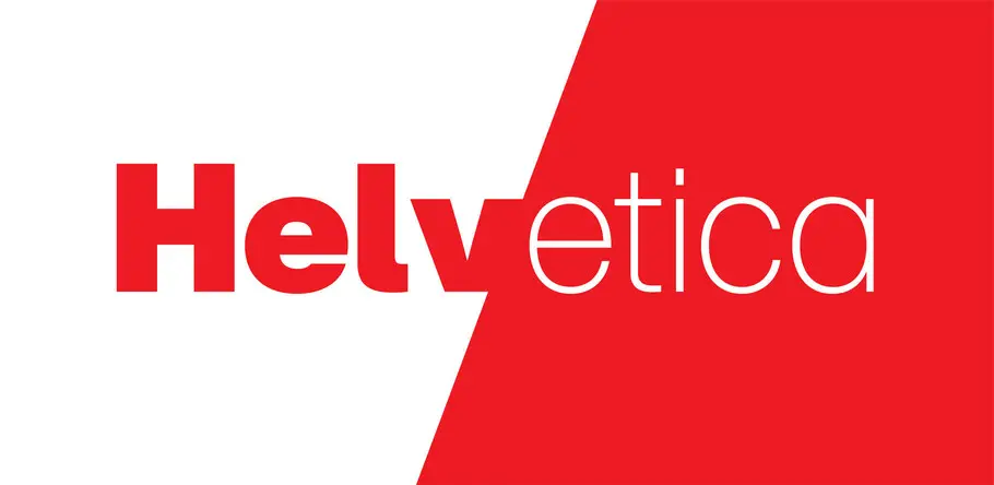
In the 60-plus years since Max Miedinger, Eduard Hoffmann, and the Haas Type Foundry unleashed Helvetica upon the world, the typeface has delighted, dismayed, captivated, and confounded the design community.
The truth is, there is no “wrong” way to feel about Helvetica. You can love it or hate it, use it for nearly anything or refuse to use it at all. It invites scrutiny and evokes passionate emotional responses, but wears all of its labels with ease. It is a kind of koan: nothing and everything at once.
But however you feel about Helvetica, no one can deny its place in our society. From the nose of the space shuttle to the dripping depths of the New York City subway system, Helvetica is an intractable presence in our lives.
“It’s vanilla,” says Monotype Type Director Charles Nix. “It’s paper. It’s a fundamental container for thought.”
It’s everywhere. And it isn’t going anywhere soon.
The power of plainness
To the average person, there’s nothing particularly distinctive about Helvetica. “Its inherent qualities are straightforward,” says Monotype Senior Type Designer Terrance Weinzierl. “It’s a neo-grotesque with even proportions, low stroke contrast, and a simple and logical finishing of details.”
That’s Helvetica in a nutshell: Simple, clean, unassuming. These qualities grant Helvetica a wide range of reasonable uses and bring order to nearly any design—from a corporate logo to the sign at a local shop to your tax forms.
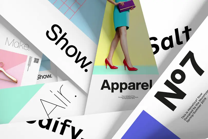
Helvetica has long been popular with corporations seeking a clean, simple, direct look.
“People don’t even think of it as anything except type,” says Nix. “It becomes the equivalent of type. It’s a typeface that everyone knows. Even without knowing it, if you think of typography ‘without feet,’ you think of Helvetica.
“This blankness is its power,” he adds. “Major corporations see Helvetica as the ultimate expression of typography; the transparent container for the message of their brand. It does its job so incredibly well that it equates them with itself. It isn’t a serif, so it’s not committed to some old style, and it isn’t new. It’s simply the thing.”
Fans of the typeface love it for this exact reason. It just is. When used well, Helvetica seems natural, firmly rooted in space like it has always been there. It organizes the world around it. While the layperson may not see much when looking at Helvetica, designers (even designers who don’t personally love Helvetica) will praise the skill, craft, and consideration that went into designing with such precision.
“Helvetica’s neutrality is widely appreciated and its studious perfection is admired by both type and graphic designers and even non-designers,” says Monotype Senior Designer Jim Ford, no fan of the typeface himself. “I hate to admit how smart Helvetica is as a design. It definitely set a standard in quality for future type.”
“You recognize something inherent in it that’s very difficult to achieve,” adds Nix. “So you have to respect it.”
A victim of its own success
Helvetica rose to prominence in the 60s and 70s, and quickly became the go-to choice for expressing modern, cosmopolitan sophistication across a huge swath of corporate America. This popularity, coupled with what Nix calls “carefully crafted letterforms that are aggressively legible,” led to its adoption in major new systems like photocomposition and, most notably, the first release of the Macintosh OS.
“It was in the right place at the right time because it was very popular at the height of photocomposition technology,” says Monotype Creative Type Director Steve Matteson. “This made it a popular choice for companies trying to convince people to buy digital composition machines. Then, because it was available in a digital format, it was an easy transfer to the desktop publishing formats.”
One might say this was the tipping point for Helvetica. The typeface went from being popular to being everywhere, and available not just to designers and creatives but to everyday people clicking away on their new home computers. Helvetica became something of a commodity within the design world—its uniqueness washed out by its ubiquity.
“After the 80s and 90s, Helvetica became synonymous with the term ‘default;’ the font you get when you don’t choose a font,” says Ford. “Helvetica was shunned when I went to college. If you used it, professors got the impression that you didn’t think seriously about the typography.”
In a sense, Helvetica was a victim of its own success. It was designed to work virtually anywhere, and that’s exactly how people used it. “One can argue that ubiquity and overuse are a signal of quality,” notes Monotype Senior Type Designer Alex Roth. “Helvetica is very easy to handle, works almost everywhere and is widely available. It has defended its position at the top of font menus for decades. Why would you blame it for that?”
Nevertheless, Helvetica came to feel like a shortcut; the easy way out for designers without the time or imagination to choose something newer, more appropriate for the project, or that simply wasn’t Helvetica.
“Any popular typeface could be criticized for being overused,” explains Monotype Senior Type Designer Toshi Omagari. “If you do all of your projects with one typeface, it naturally invites a criticism that you haven’t given it enough thought. That lack of thought is what the overuse of a font represents.”
Ford adds, “I distinctly remember hearing in critique, ‘If you are going to use Helvetica on a creative project, you better have a really compelling reason. Because there aren’t that many reasons.’”
“The mystic art of Helvetica”
The popularity of Helvetica also exposed its shortcomings, many of which accumulated over successive updates and reissues during the 20 years following its release. This progression culminated with Neue Helvetica, the early 80s adaptation that digitized Helvetica and brought it to the personal computer.
Helvetica was originally drawn with optical sizes, but Neue Helvetica was based off a single point size master that is scaled dynamically when a user selects a specific size within their application. This resulted in poor legibility at small sizes and forced designers to nudge and manipulate the font at display sizes to achieve acceptable results. Nix fondly refers to these display tricks and modifications as the “mystic art of working with Helvetica,” but the fact is that Neue Helvetica didn’t work well right out of the box. Neue Helvetica also excluded many popular alternate (and not always official) characters Helvetica had picked up over the years, robbing it of some personality.

“What we lost in our initial rush to digitize everything in the 80s and 90s was the subtlety that existed in metal and film, where there were multiple master drawings that were created for specific sizes of type,” says Nix.
As time went on and technology advanced, Neue Helvetica … didn’t. It is still very much a product of the pre-internet age, when few could anticipate the demands that modern computing places on fonts. The home computer also ushered in the current era of digital type design, which allowed foundries to create more typefaces than ever before. Designers now have access to thousands of modern fonts, many that outperform Neue Helvetica on mobile devices and high-resolution screens.
“In my opinion, there is so much good type now,” says Ford, “Helvetica should have become obsolete decades ago.”
Why do we keep coming back for more?
As we all know, that did not happen. Helvetica has remained popular with major brands and maintains an irrepressible presence in the design world. But why?
On the surface, its relevance remains connected to the things that made it successful in the first place: A clean, simple, orderly design that simply refuses to go out of style. “Even if you don’t want Helvetica, you still need it,” explains Ford.
“Do I like Helvetica?” Weinzierl muses. “I did and I didn’t. I’ve gone back and forth for years now. I’ve never loved or hated it; it’s just always around, doing its thing. Helvetica is trustworthy, even if it doesn’t excite you.”
“Helvetica is right in the middle of everything,” explains Monotype Creative Director Hendrik Weber. “It has humanistic elements like the tail of the letter ‘a’, but on the other hand it’s really geometric. It looks constructed. It has balance and contrast, and it looks really modern, so it has a little bit of everything.”
But Helvetica also has history now; a story of success and ubiquity that is part of its DNA. And while this history may deter some designers from using it, it also serves as a kind of challenge: How can we take this thing that everyone thinks they know and make it new?
“It’s hard for me to pinpoint how, when, or why Helvetica is useful because it seems to come up when I’m taking an anti-design approach,” says Ford. “I’ve used Helvetica once or twice, somewhat abusively. I would either destroy or photocopy it, reduce, enlarge and re-scan to the point that it was no longer representative of the digital font, and then I would reassemble it as needed. Helvetica is tempting to manipulate.”
“Throughout the 90s and early 2000s, people started using it as an expressive medium, leaning on the lighter and heavier weights to find a more creative voice,” adds Nix. “If you go back to the second phase of Neville Brody’s storied career, he began challenging Helvetica to move beyond its past. I’d say it was the beginning of probably a 10-year period where people were either copying him or building on that idea of taking Helvetica and other ‘basic’ typefaces and using them in a way that people didn’t expect. It’s pretty much textbook postmodernism.
“The true subversive Helvetica users look at it and say its neutrality is a disguise.”
The next era
The release of Helvetica Now marks a fresh start for the typeface. Helvetica Now directly addresses the design shortcomings of Neue Helvetica with optical sizes optimized for different applications and a particular focus on tiny sizes for mobile devices and high-resolution screens. Micro is meant for 3, 4, 5 and 6 point; Text for 8, 9, 10, 11, 12; and anything beyond that, from 13 to infinity, can be handled by the Display range.
Helvetica Now also includes many popular alternates and new characters, such as a hooked lowercase l, straight-legged capital R, a much-needed redrawn @ symbol (remember, Neue Helvetica was created long before email), and Nix’ personal favorite, a new £ symbol.
“Thirty-five years have passed since Neue Helvetica was released, and since then we’ve become more accustomed in typography to the idea, especially in the last couple of years, that size-specific typography matters,” says Nix. “We’ve brought those back for Helvetica Now.”
“The Micro size has been necessary for so long and makes it possible to use Helvetica successfully in a full typographic system,” adds Matteson.
While these changes can’t quiet the crowd claiming Helvetica is overused, Helvetica Now seems poised to kick off a rebirth of sorts. After all, the design has never truly fallen out of favor, and the vastly improved legibility and renewed vitality of Helvetica Now make it an ideal fit for modern brands, now and in the future. The right font at the right time, yet again.
“Fashion trends build and build until something breaks,” says Weinzierl. “Helvetica has survived quite a few cycles, and I expect it to keep going. I’ve seen designers choose typefaces that are very similar to Helvetica without realizing they were shopping in the same genre. ‘We didn’t even consider Helvetica,’ they said, but it was the style they were looking for. I’m optimistic our new cut will help people use it in new and better ways.”
For all it has endured, one might be tempted to call Helvetica “timeless.” Every time it gets knocked down, Helvetica gets back up, much to the disappointment of its detractors and relief of its believers. But Omagari is quick to point out that Helvetica has a very long way to go before it achieves that status.
“Helvetica’s timelessness is yet to be proven,” Omagari argues. “Garamond’s typeface is about 400 years old and still popular. Baskerville is 250 years old and still popular. Helvetica hasn’t been around long enough to call it timeless, but it has certainly dominated post-war branding and advertising.”
“Concepts can be timeless but any representation is linked to a certain time period, a certain taste,” says Roth. “Helvetica is no exception. What keeps it relevant might be the better question: I think it is the design’s humanistic elements, since true beauty is in curves, not angles.”
“Better to say Helvetica is of our time,” suggests Matteson, “but not timeless. It has 50 years of popularity compared to 1,000 years for the Trajan-style capital. We will never know its true longevity.”
That said, Nix thinks the typeface’s versatility will keep it relevant for years to come. “There are a lot of different ways people can use Helvetica,” he says. “Some subscribe to the very Swiss, modern aspect, some subscribe to the perfunctory aspect, some subscribe to the default aspect, and some designers subscribe to all of them at different times. It has different ways that it can be used and thought about. No other typeface manages that feat.”
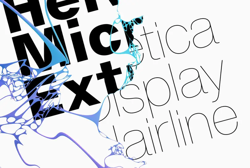
Helvetica Now is comprised of three optical sizes optimized for different use cases.
So, however one feels about Helvetica, it seems determined to stick around a while longer. Weber believes it has earned its status as a “standard” of graphic design and hopes Helvetica Now preserves that standard for the future.
“What we’ve created in Helvetica Now is the potential to see Helvetica completely differently,” says Nix. “To make it relevant in a new century.”
Charles, Hendrik, Steve, Terrance, Alex, and Jim were all part of the Helvetica Now design team. To learn more about Helvetica Now, visit the specimen page.
