
Royal Caribbean’s extended Proxima Nova is powering development in new markets.

Powering development in new markets for Royal Caribbean
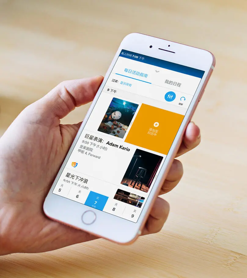
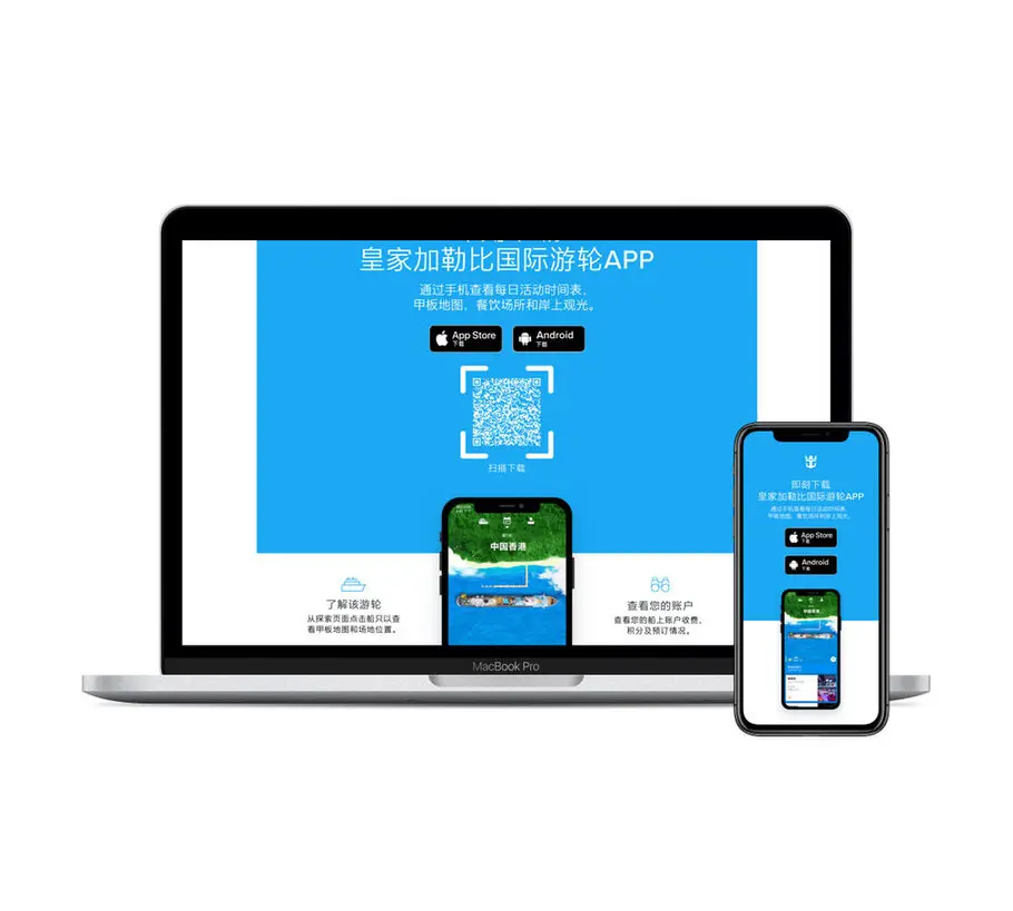
As Royal Caribbean continued to engage with a new market in China, it needed to develop its digital presence to better serve this group of customers.
About the company.
Design and innovation have been at the heart of Royal Caribbean since its inception in 1969. One of the largest cruise lines in the world, it has pioneered the development of cruise ship architecture and technology—such as introducing rock climbing and ice skating to its ships. Its fleet includes the largest cruise ships in the world, including Symphony of the Seas. Royal Caribbean sails to destinations including Mexico, the Bahamas, Italy and Alaska, and serves customers all over the world.
The challenge.
The company was already using Proxima Nova as a brand typeface in several different weights and styles, however needed fonts that offered simplified Chinese. Not only did these have to feel part of the Royal Caribbean brand voice, but it was key they didn’t disrupt the digital experience. This meant any new fonts would have to be lightweight in terms of file size, to create a slim loading package for websites and apps, but without sacrificing clarity and legibility. More than this, Royal Caribbean needed a complete set of weights, enabling it to work with a full typographic palette.
The solution.
Monotype’s design team worked together with Royal Caribbean to create 16 weights of Proxima Nova that included access to the Chinese font MYing Hei PRC Medium. This choice ensured that any simplified Chinese characters would harmonize with Latin characters set in Proxima Nova so as not to undermine Royal Caribbean’s visual identity and branding.
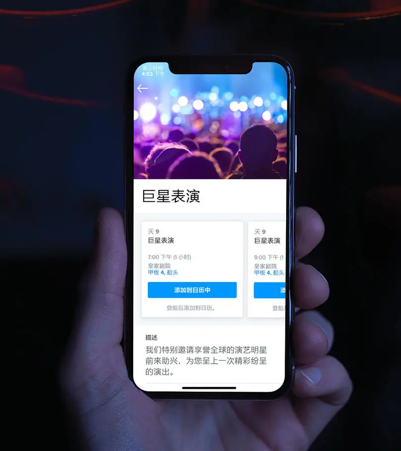
Another key priority for the brand was to ensure that any new fonts wouldn’t slow down the customer experience. To this end, Monotype delivered a set of custom weights that wouldn’t impact the loading time for Royal Caribbean’s website or mobile app, and could be bundled together as a single file. The team tested their use across iOS and Android, and ensured that Latin and simplified Chinese characters could be combined without inconsistency in size and placement.
To further streamline the customer experience, the design team tailored the weights to offer an optimal set of options all while meeting tight deadlines for shipping digital products to China. Together with the design team, Royal Caribbean also reached a single clear and simple licensing agreement that covered the use of the new custom fonts in addition to existing Proxima Nova files.
Byron Gronseth, Director, Product Design, Royal Caribbean Cruises, ltd.
Results.
Internal:
- Support and enable the expansion into a new market in China
- Meet tight deadlines for shipping digital products to China, saving engineering time and money
- A typographic palette, offering simplified Chinese characters, that can be used across Royal Caribbean design teams
- Ease and speed of sharing type files with the relevant creative teams and leadership
External:
- Communicate clearly with Chinese customers through website, iOS and Android apps
- Maintain a sense of Royal Caribbean’s visual identity across different languages, with type that still feels part of the family
- Create an easy and enjoyable digital experience for customers
Alberto Orsini, Sr. Manager, Product Design, Royal Caribbean Cruises, ltd