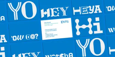
Elevate your Brand: 4 Simple Design Strategies with Proven Results.

Design choices might seem superficial — but clear, engaging brand systems deliver significant impact for small businesses. A strong visual identity can give you an advantage by telling a clear story about your products or services and convincing customers to convert. Ultimately, effective design delivered consistently across key touchpoints can help you:
- Stand out from the competition
- Develop long-term customer relationships
- Deliver impactful experiences that improve customer retention
Think about some of the most trusted brands in the market. Why do we keep going back to them? It’s because they tell a consistent story – the visual identity they present is familiar, no matter the platform.
Now take a look at your business and imagine seeing it for the first time. Are you presenting the same visual identity everywhere? And everywhere means everywhere: website, business cards, social media, ads, invoices!
As your business grows, the significance and reach of every design choice is amplified. By developing a system of core design elements and making sure key touchpoints look and feel consistent, you can enhance operational efficiency, elevate client experience, and foster long-term growth. But which elements matter most? And which touchpoints have the biggest impact on your business?

Must-have elements for small business brand design
Effective brand design should establish and reinforce your brand story – the product/services you sell, the problems you solve for customers, and the values that guide your work. Brand design communicates this information primarily through individual elements like color, typography, logos, and icons. But these different parts have to add up, make sense together, and appear the same across touchpoints. In the end it’s similar to humans – we choose to present ourselves a certain way in order to convey our identity and personality, from our clothes to our hairstyles. Every aspect plays a key role.
Here’s what to look out for, and where to implement – as well as some insights into how a few small changes can improve your overall brand performance:
- Color : Ensuring a uniform color scheme across all platforms might not seem like a top priority, especially for a small business. But random colors can be distracting, confusing, and may even erode confidence in your brand. If a new visitor lands on a website with harsh or clashing colors, it might cause them to bounce away faster or choose a competitor with a more professional-looking page. Less is usually more – pick a concise color palette and stick to it.
- Logos : Branding is storytelling, and great stories start with an amazing cover. Think of your logo like a book cover—it’s usually the first thing customers see, therefore it should communicate a clear idea about your product or service. The elements of your brand should look like they’re all part of the same world, help customers make important connections, and tell easy-to-understand visual stories.
- Icons : Icons and imagery can help users make split-second decisions. Developing a few personalized icons will give customers better tools to navigate through your channels and deliver a happy digital wayfinding experience, ensuring customers always know where they are in the customer journey. Icons can solidify your brand’s identity across digital and print channels and create a cohesive user experience from discovery to purchase.
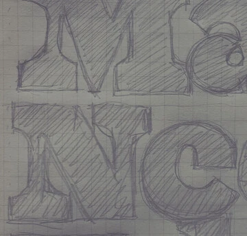
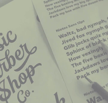
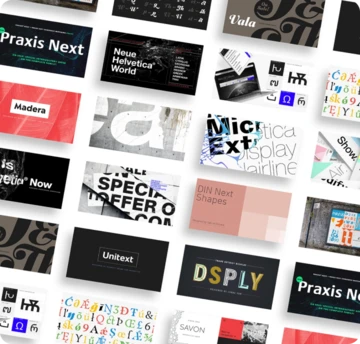
- Fonts : Typography is the key to sharing your message. The letterforms you select play a pivotal role in how your audience will connect with your brand. A font is never neutral, and that’s why it’s essential to pick wisely. And remember, rather like with people, certain couples work well, while others really don’t. Check out Monotype’s nifty tool to find your perfect font pair.
Small businesses that pay attention to these details are more likely to present a unified and coherent look that potential customers can more easily trust. By ensuring these are carried through no matter the medium or the platform, you will minimize the risk of confusing or even losing your customers along the way, and tell a clear story about the problems you solve and the value you generate.
- Which brand touchpoints have the biggest impact?
Now that we’ve covered the important design elements, let’s do a quick audit of the specific places where these visual stories come to life. Is your brand speaking the same language and conveying the same identity across all channels?
Let’s go through the top 4 touchpoints where consistent brand design delivers the most value:
- Website : Your website is the central nervous system of your business, and as such it’s the place with the biggest potential to convert a browser to a buyer. Your website should be easy to navigate, with a clear information hierarchy. The above-the-fold “splash” section should make it immediately clear what sets your business apart and where your customers should go to accomplish what they’ve come to do. Use design elements like colors and icons to deliver an intuitive user experience and answer common questions about products/services, pricing, processes, customer testimonials, and more.
- Social channels : Social accounts can be a place to acquire new leads and stay in touch with current customers. These channels are less about showcasing your products/services, and more about building a community. You can share educational or entertaining content around topics that matter to your target customer, start or join industry conversations, and engage directly with your followers. It’s generally appropriate to strike a more casual tone on social media, so you can stretch your brand a little and experiment—maybe you have some fun brand colors or fonts that only come out to play on Instagram. Whatever you decide, establish consistent visual rules so that followers can start to recognize your posts and connect your content to your brand. Design tools like Canva offer templates that allow you to blend your brand elements with pre-built designs for easy experimentation. Allow yourself to think outside the box, this is an arena where you can afford to experiment.
- Email, SMS text, and other direct comms : Any direct communication with a customer is a critical touchpoint—be it a marketing email, SMS text message, video call, or direct mailer. Do a quick audit to confirm that these materials all contain some form of related brand design elements. Use colors and logos to make sure the way your brand shows up in an inbox matches the way your brand shows up on a video call, even if it’s subtle.
- Payment flows : You might not think of invoicing as a huge branding moment – but you’d be wrong. Let’s imagine that your customer has been on a consistent visual journey from discovery to purchase, and then just at the finish line you undermine all the thoughtful design that came before with a generic-looking invoice. This is a major design miss that can actually shake confidence in the security of your payment process and give clients a bad impression about the overall professionalism of your business.
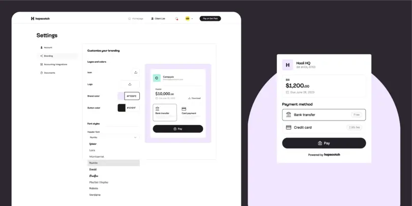
The payment experience should match the look and feel of your brand, and make it easy for customers to pay you. Luckily, tools like Hopscotch help businesses customize and automate the invoicing process.
“We built Hopscotch to make invoicing a breeze for small businesses and agencies. Use our invoice templates to add icons, colors, and logos to your invoice, then drop payment links into any digital channel. Clients can pay you instantly without needing to create an account.” - Reed Switzer, Founder of Hopscotch
By ensuring a unified look at every step of the journey, from the moment your customers first land on your website to the moment they pay their bill, you’re increasing trust, raising awareness, fortifying your unique selling proposition, and enhancing your credibility.

Use these tools to nail your brand design
Businesses that build simple but effective brand design can stand out from the competition. By ensuring that the most critical moments in the buyer journey look and feel connected, you can build trust with your audience and deliver experiences that help your business grow. Start with the basics and then go from there.
And remember there are tons of tools available to help formalize your brand design and make sure it shows up consistently across key touchpoints. We already mentioned Monotype’s Font pairing engine and Hopscotch’s branded invoices, but there’s so many more out there. For some inspiration, check out the Ultimate Stack, a curated list of tech solutions for small teams like yours.
