


Good Type part 5: Good type is family.
A good typographic system is like a family—and just like people, it comes in all shapes and sizes.
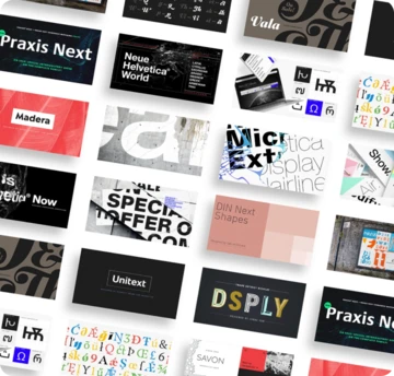
While working with display type often means focusing on one font or a few, families include sets of fonts that work together to cover different environments, uses, and voices. These kinds of systems are essential when it comes to branding, which requires type to work across multiple touch points and serve different purposes.
The basic family unit spans four fonts, and offers everything needed to format a Word document: Regular, Italic, Bold and Bold Italic. However, many designers need to go a step further and work with a broader family, which typically offers ten to 20 variations. This maintains a consistent voice and identity, while allowing the fonts to be subtly modulated as needed. This kind of flexibility is essential when it comes to nuanced typographic details, or for creating variation between a heading and subheading.
In recent years, family systems have become more popular. These are slightly different, in that their structure is based on the concept of the typeface. A good example is Monotype designer Jim Ford’s Posterama, which covers seven weights that come in eight different flavors, all inspired by events, movements and typography of the 20th century. Sabina Chipară’s Rosella also offers an alternative take on the typographic family, with six layerable weights that can be paired together to create new combinations. These kinds of family systems are playful and expressive, but also help reduce the number of decisions designers and clients have to make. They function as a self-contained world.
The most comprehensive typographic system is the super family, which typically covers around 40 or more weights. The invention of the super family is often attributed to Adrian Frutiger, who designed Univers as a complete tool for commercial designers, one that would let them bring the weight or width of the font up or down as they needed.
“The thing for graphic designers is that no matter what space they had to work with, changing the typeface through the different options available didn’t distort that voice,” explains Monotype Director of Product Design Jamie Neely. “It always looked like Univers, and it always looked cohesive.” Super families are powerful tools, and are becoming an ever more essential part of designers’ toolkits as the demands on type increase. They guarantee a consistent tone of voice, as well as the versatility to work in many environments.
Their growing popularity means that much-loved typefaces are being extended into full systems, expanding their potential usage. DIN—which remained popular for a century, despite only having two weights—is a good example, having been extended into the DIN Next family which includes DIN Next Slab, DIN Next Stencil, and DIN Next Rounded. Despite being translated into new fonts, the typeface has retained its character.
Much of the skill and planning that goes into creating super families is about ensuring the DNA of a typeface is maintained across different classifications and multiple languages. “It speaks to the value of super families, which for me are some of the most valuable type options we have,” adds Neely.
Stay tuned for more from the Good Type series. Video recorded live at Adobe Max 2017.


