Charles Nix.
Senior Executive Creative Director.

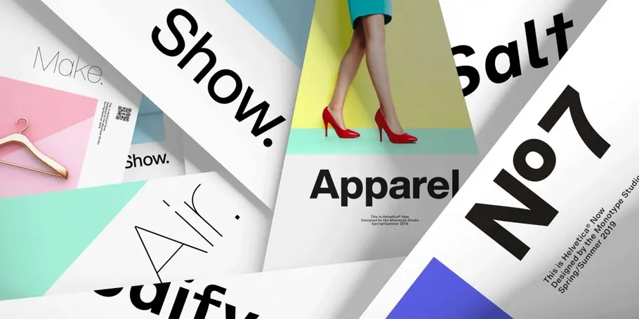

Hope Sans™ takes the jaunty style of 1950s and 60s lettering and melds it with the jubilant 1970s swashes of Bookman.
Helvetica Now preserves the typeface’s Swiss mantra of clarity, simplicity and neutrality, while updating it for the demands of contemporary design and branding.
Walbaum has been fully restored for this expansive family, which includes 32 weights including ornaments and two decorative cuts.
In his words.
Charles Nix is a Senior Executive Creative Director, designer, typographer and educator. He was lead designer for Helvetica Now and has designed a number of popular typefaces in the Monotype Library, including Walbaum and Hope Sans, which received a Certificate of Typographic Excellence in the 22nd Annual Type Directors Club Typeface Design Competition. He’s also designed custom typefaces for M&M’s and Progressive Insurance and contributed to the massive Google Noto project.
Prior to his position at Monotype, Charles co-owned a small publishing firm, where he designed hundreds of books, while also orchestrating all aspects of book production, from writing proposals to supervising printing. His experience in marketing, publicity and advertising gives him a unique perspective into the importance of type in branding.
Charles is also an educator, having chaired the Communication Design departments at the Center for Advanced Design in Malaysia and the Parsons School of Design in New York. He is also chairman emeritus of the board of the Type Directors Club (TDC), an international organization dedicated to furthering typographic excellence.
Charles has taught dozens of courses in graphic design, typography, and publication design for organizations, including Adobe Fonts, the TDC, Cooper Union (Type@Cooper), Typophiles, TypoCircle, and RGD; and recorded a number of type design courses for LinkedIn Learning.
Studio releases.
Helvetica Now
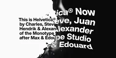
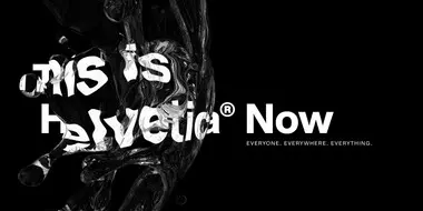
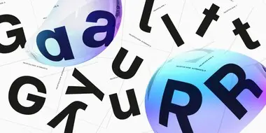

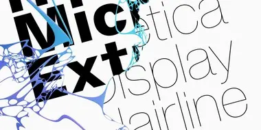

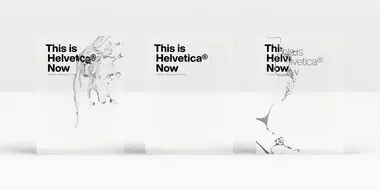
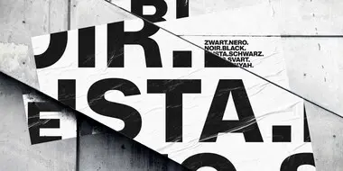
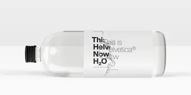
Helvetica® Now is a new chapter in the story of perhaps the best-known typeface of all time. Available in three optical sizes—Micro, Text, and Display—every character in Helvetica Now has been redrawn and refit; with a variety of useful alternates added.
Helvetica Now Variable
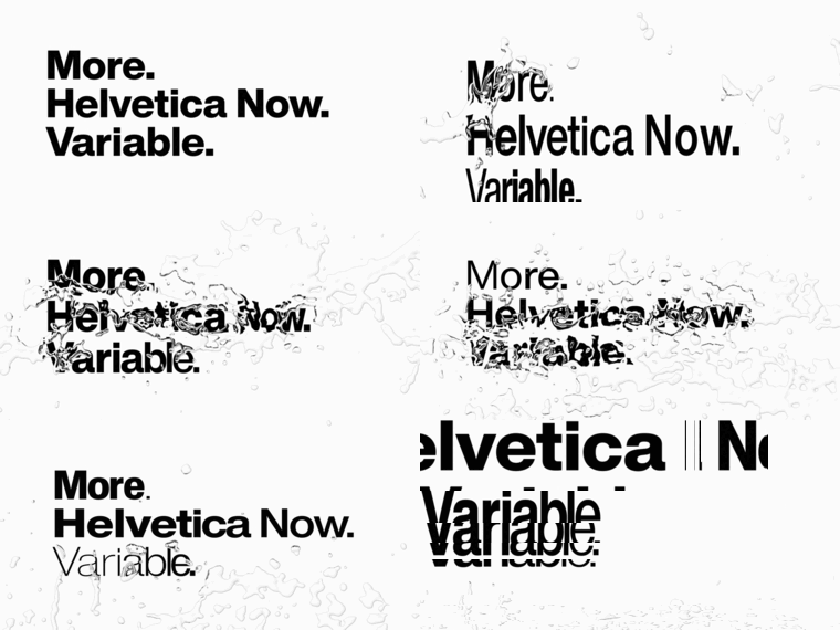
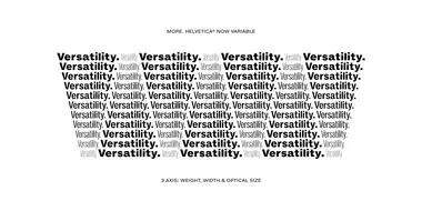
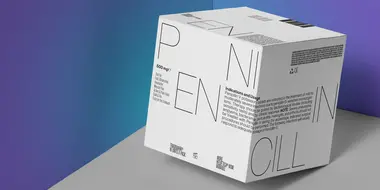
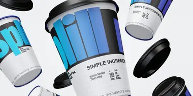
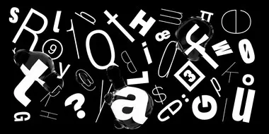
Helvetica® Now Variable builds on the groundbreaking work of 2019’s Helvetica Now release—all of the clarity, simplicity and neutrality of classic Helvetica with everything 21st-century designers need (optical sizing, stylistic alternates, and extended character set).
Helvetica Now Variable offers designers more of everything: more creative freedom; more typographic expression; and more power.
Helvetica Now Variable. More. Helvetica. Now.
Hope Sans
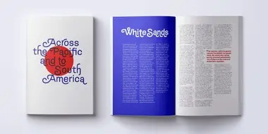
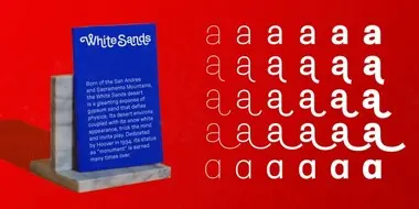
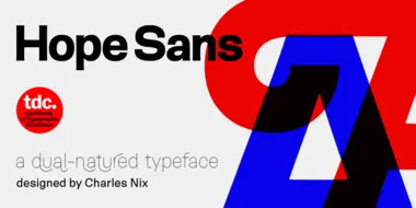
Hope Sans™ takes the jaunty style of 1950s and 60s lettering and melds it with the jubilant 1970s swashes of Bookman. The result is a sans serif family that is lively, inviting and deeply customizable. Its basic sans serif forms create engaging text, while a roaring collection of swash designs, alternate characters and ligatures make it a natural for attention-grabbing display typography.
Walbaum
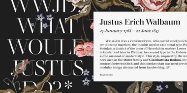
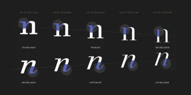
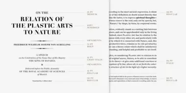
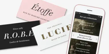
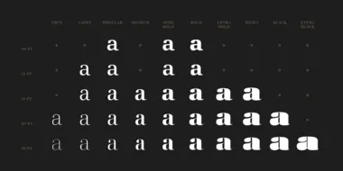
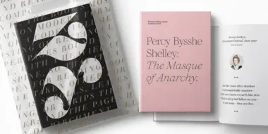

The Walbaum family, designed by Charles Nix, Carl Crossgrove, and Juan Villanueva, is a modern serif design that can be used in a wide variety of placements from micro caption text to massive headlines. Where other moderns preach austerity, Walbaum projects warmth—making it ideal for brands seeking a large type family that blends high style and approachability.
Ambiguity
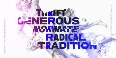
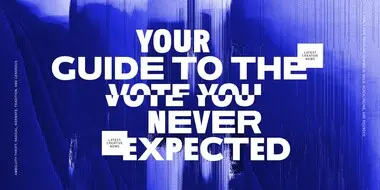

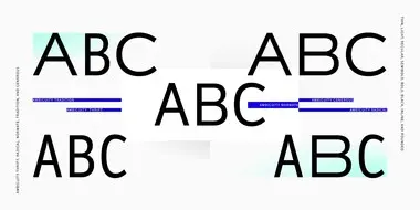
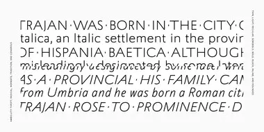
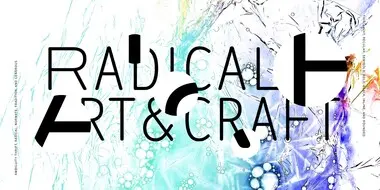
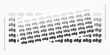
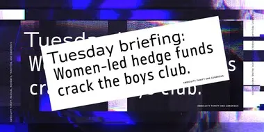
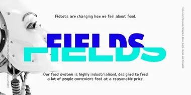
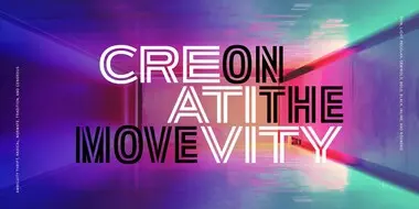
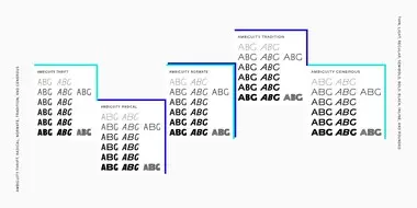
Ambiguity embraces both tradition and radicality, as well as generosity and thrift, encouraging us to question our beliefs about the intersection of style and meaning. With five distinct states of being—Tradition, Radical, Thrift, Generous and Normate—Ambiguity merges established concepts with inverse proportions, creating an exciting tool for tweaking text and expressing a range of attitudes and beliefs—from conventional to unorthodox and frugal to extravagant.
Thought leadership.
The state of Ambiguity.

Related content.
All Together: A Playful New Typeface That Reflects the Joy of M&M’S.
M&M’S® has been bringing people around the world together for more than 80 years. This year, the iconic brand got a modern makeover, with a revamped purpose of creating a world where everyone feels they belong. Other changes include a fresh look and updated personalities for the famous M&M’S characters; a more inclusive and welcoming tone of voice; and a new, attention-grabbing typeface called All Together — a large, warm, playful, and conversational family.
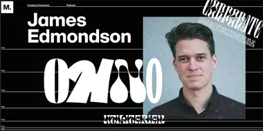
Creative Characters S1 E12: James Edmondson: Let the design be what it wants to become.
In our twelfth episode, Creative Type Director Charles Nix speaks with James Edmondson, founder of OH no Type Company in California. James shares how he got his start in typography, as well as his perspective on designing a fulfilling creative career.
Creative Characters S2 E16: Craig Ward: From metal type to the digital unknown.
This week, host Charles Nix sits down with Craig to talk about his career, his myriad side projects and quirky pastimes, and how technology could revolutionize the way we use type and ensure the rights of ownership for designers.
Creative Characters S4 E9: Angelina Lippert: Charting the human experience through poster design.
Creative Type Director Charles Nix talks with Angelina Lippert, Chief Curator at the Posterhouse museum in New York City, about the history of poster design, the unseen hands behind some of the more iconic posters from history, and the finicky wonder of Rubylith.
