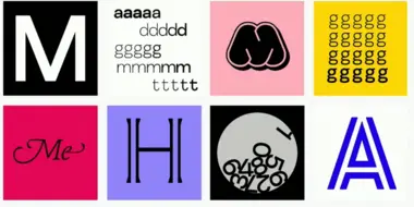
All Together: A Playful New Typeface That Reflects the Joy of M&M’S.

Charles Nix, Creative Type Director.
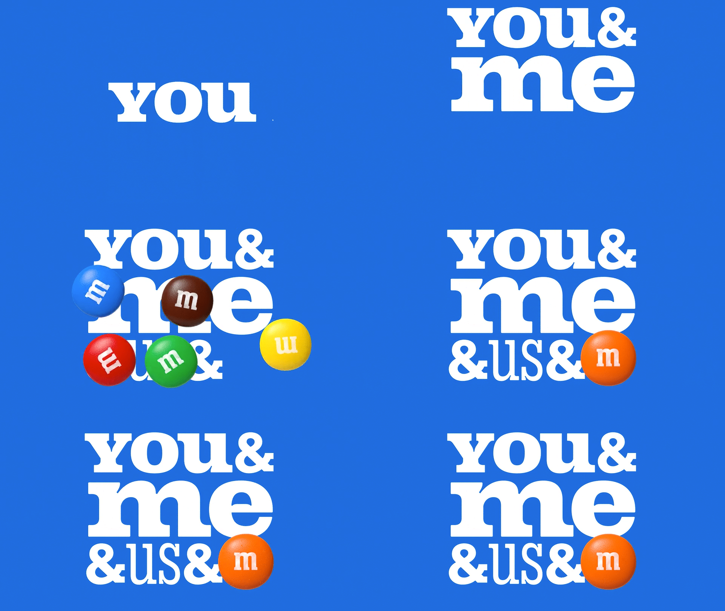
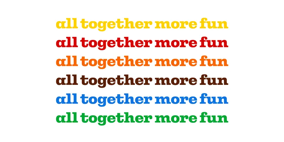
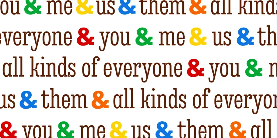
M&M’S® has been bringing people around the world together for more than 80 years. This year, the iconic brand got a modern makeover, with a revamped purpose of creating a world where everyone feels they belong. Other changes include a fresh look and updated personalities for the famous M&M’S characters; a more inclusive and welcoming tone of voice; and a new, attention-grabbing typeface called All Together — a large, warm, playful, and conversational family.
A strong long-standing relationship led the M&M’S team and their agency, Jones Knowles Ritchie (JKR), to choose Monotype for the brand’s first custom typeface design. Monotype’s global language support was important, too. “Monotype is such a big brand, with the ability to develop type for lots of languages and markets. I felt more comfortable working with a partner that has that scale and international awareness,” Mars’ Global Director of Brand Identity and Design, Steffi Marty, said.
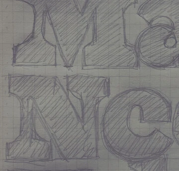
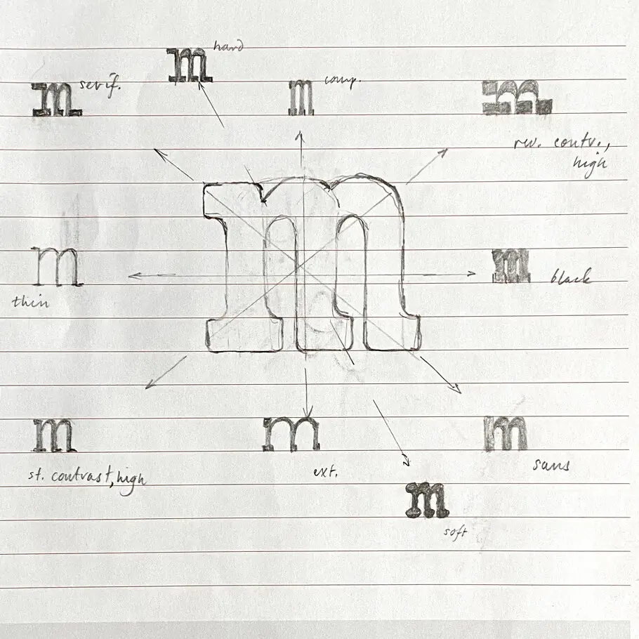
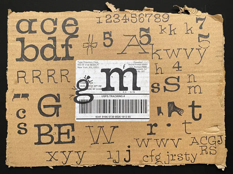
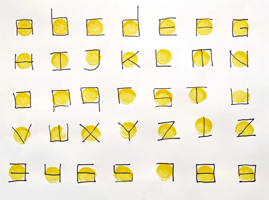
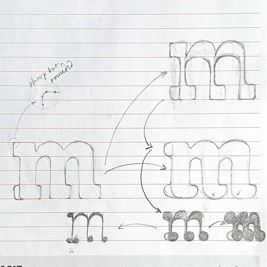
Sketches from early stages of the project.
To fuel the collaboration, the design teams were offered a clear vision as a guide. “As the M&M’S brand takes on a wonderful purpose, we want the identity to reflect and support the communication of all of that. The intent of the identity is to live the purpose, to be more digitally savvy, and to make the purpose omnipresent in all we do,” Marty explained. JKR’s design team collaborated with Monotype Creative Type Director Charles Nix and Type Designer Juan Villanueva to harmonize the typography with the brand’s new visual identity.
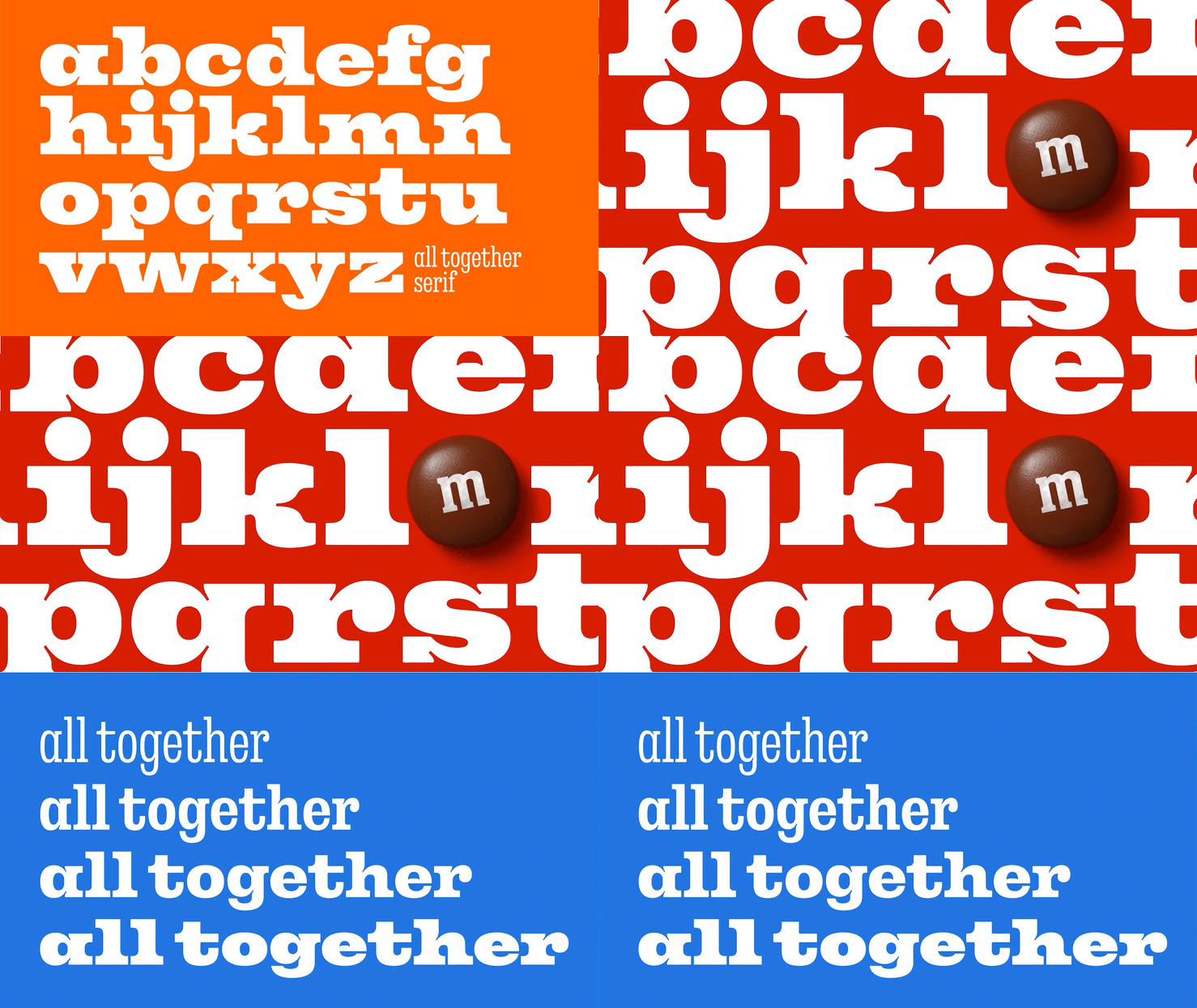
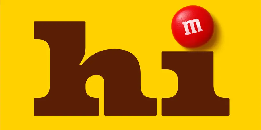
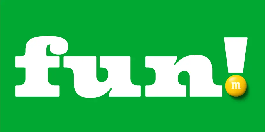
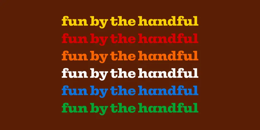
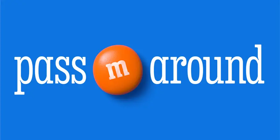
The first imperative was personality — the new typeface needed to scream “M&M’S” right away. Nix and Villanueva achieved this with a big, chunky, characterful slab serif style that hearkens back to the vintage M&M’s look and reinforces the brand’s jester wit. Incorporating joyful details — like smile-shaped ink traps and round ball terminals that look just like the candy — amped up the fun.
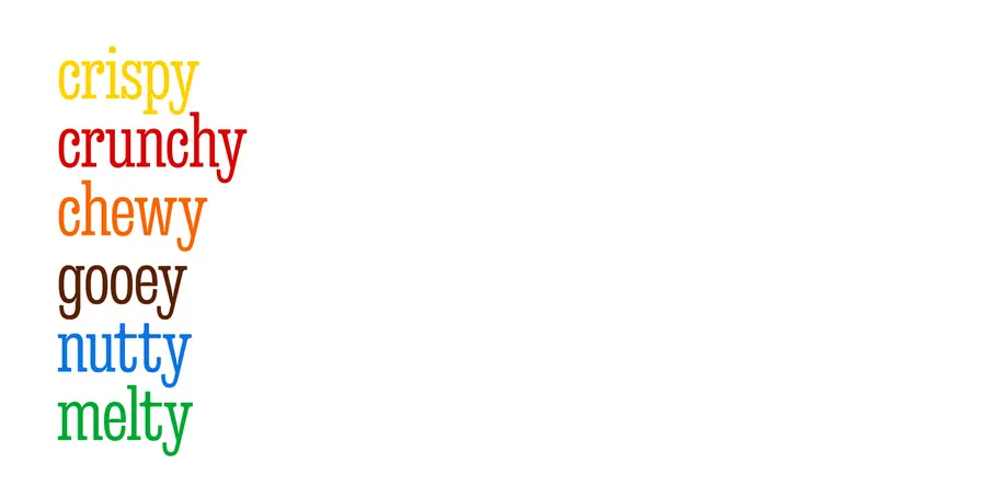
Flexibility was another essential element. All Together would be used in everything from packaging to video to digital text; that led to the decision to use variable font software, which incorporates a huge range of width, weight, and style variation within a single font file. All Together Sans and All Together Serif represent a huge design spectrum capable of crisp type for small, dense packaging text and charismatic headlines and animations.
“For a brand of the scale of M&M’S, you really need flexibility with the type,” explained Lilia Quinaud, Senior Designer with JKR. “Having both a sans and a serif family gives you the flexibility you need to show both functional information and fun, bold attention-grabbing information. We started with All Together Serif, which is inspired by the drawings and serifs of the logo. That’s why it feels like M&M’S as soon as you see it.”
With more type options, designers have the freedom to combine and contrast letterforms to achieve the perfect look or emotion to suit the message. “The All Together Sans and Serif families are not a collection of static instances. The spectrum of possibilities creates a new, multi-dimensional design space with opportunities to create more fluid and expressive visuals,” Nix said.

Variable type is perfect for representing the voices of each of the updated mascots, too. “For me, the real ‘aha’ moment was when we saw the revised characters speaking in their typographic voices,” Nix said. “Within this family, there’s so much expression typographically that characters as different as these can each find a unique voice.” M&M’S new typography truly reinforces the goal of the rebrand: we’re All Together, and there’s strength in our diversity.
