Tazugane Gothic Info adopted for display in smart motorcycle helmet.
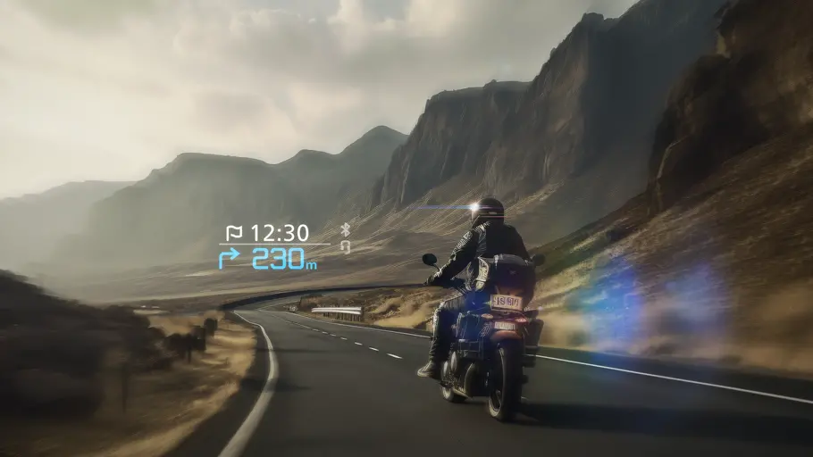
Monotype’s Japanese typeface, Tazugane Gothic® Info has been selected by SHOEI Co., Ltd. as the font used in Opticson, a smart helmet for motorcycle riders mounted with a head-up display (HUD).
This smart helmet is a groundbreaking product that shows textual information on a display in the visor when a motorcycle rider connects their smartphone via Bluetooth, allowing them to access necessary details while driving. The information is shown as if it is floating 9 meters ahead of the rider to minimize distraction and ensure safety. The upper row of the HUD shows information such as estimated time of arrival and outgoing phone calls, while navigation information, including turning instructions and distance to destination, are displayed on the lower row.
The display system was developed by NS West Inc., a company specializing in designing and manufacturing in-vehicle displays. Wearing a helmet narrows the rider’s field of view, so it was essential to design a display that limits eye movement to a minimum to promote safe riding.
The black background shape is envisioned as a transparent plate on which the HUD (Head-Up Display) is projected.
As part of the selection process, Monotype had to examine which fonts are easiest to read when driving a motorcycle which causes more vibration than when driving a car. Tazugane Gothic® Info was selected for its exceptional legibility even in driving settings with strong vibration, as well as at night and during bad weather conditions. The typeface’s simple elements, harmony with symbol marks, and futuristic design made it a reliable choice for a motorcycle HUD.

Tests were also performed where drivers wore the helmet showing textual information with Tazugane Gothic® Info on the heads-up display to verify the optimal thickness and size of the font. The display uses the typeface’s Medium weight as thinner weights wouldn’t be legible and uses Regular and Bold for graphics that are displayed in small sizes.
Tazugane Gothic® Info was chosen as the typeface to minimize the reading load and protect motorcycle rider’s safety, as they need to instantly read textual information and make quick and accurate judgments. It is used as the typeface of choice that is highly reliable even in severe environments.
Akira Kobayashi.

Creative Type Director Akira Kobayashi has nearly four decades of experience and an extensive background in Japanese typeface design and is a 2022 TDC Medal and Keinosuke Sato Award winner. After studying at Musashino Art University in Tokyo for four years, Akira Kobayashi accepted his first job at phototypesetting manufacturer Sha-Ken Co., where he was involved in the lengthy and intricate process of designing Japanese fonts.
Ryota Doi.
Ryota Doi is a Senior Type Designer for Monotype. Ryota first became interested in type as a design student while at university in Japan. After receiving his BA in design from Tokyo University of the Arts, he enrolled in the MA typeface design program at the prestigious University of Reading, where he studied the differences between Japanese and Latin type.

The Making of Toyota Type.
Learn how Toyota Type was developed as part of the iconic automaker’s new brand identity.


SUMMA Branding at Brand Talks Connected – EMEA.
Pablo Amade, Creative Director for SUMMA Branding, presents his Correos case study at Brand Talks Connected – EMEA on November 18, 2020.