Creating the typeface for SAP Fiori.

Monotype’s Terrance Weinzierl helped software company SAP to develop a typeface for SAP Fiori, for which SAP won a Red Dot Award in 2015. It was important that the design of the typeface works well in text-based UI environments without compromising on personality. The new typeface, called 72, has won a 2017 Red Dot Award.
With the launch of SAP Fiori, the company needed a set of fonts that could offer a robust typographic hierarchy and help users navigate text-intensive screens. With the user interface revolving almost entirely around text, it was key that the fonts work comfortably across a variety of screens.
“Good typeface and typography play a significant role in UI, even though it’s mostly unnoticed by the user,” says SAP’s Jeong-Sook Lee. “A good typographic system creates a clear visual hierarchy by utilizing the right balance between different sizes, weights and styles. A beautiful typeface with great legibility at any scale in different weights and styles is what we need for our UI.”
In addition to all the technical requirements, it was key that the typeface balanced performance with style – able to perform well with readability, scalability, and accessibility, while conveying the voice of SAP clearly.

“With many digital products, the experience is the brand,” explains the company’s John Pompa. “Our users need to consume this content without difficulty,” he adds. “We can’t have the design get in the way of people being able to function efficiently.”
Searching for a replacement for the default Arial typeface, SAP and Monotype’s Terrance Weinzierl met to discuss type styles that could communicate content as trustworthy, while emphasizing a sense of warmth and friendliness.

“We had this concept of Neo Grotesques like Arial and Helvetica that represent something serious and true, but we needed to avoid being too cold or bland,” explains Weinzierl, who helped SAP look at a full spectrum of Grotesques, Humanist, and Gothic faces. “It was that combination of having something that looked serious, but still had enough of the SAP Fiori concept behind it – which is to make something consumer-friendly. That’s where we found the sweet spot.”
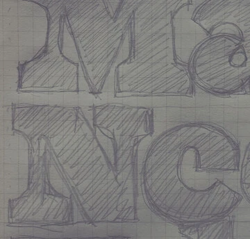
Weinzierl started by drawing the lower-case a and g – letterforms that are ‘notorious’ for containing a lot of design DNA. Both forms reference the shape of a Trade Gothic g, and feature that Weinzierl calls “a big bouncy ear”.
“I think even just a few small details like that, within that kind of Grotesque framework can liven it up a bit,” he explains. “And I guess that’s the difficult part with type design. If one set of details is too spicy then it changes the flavor really fast, because that detail is repeated dozens of times on a page. It’s very much about being subtle.”
Taking around four months to finish, the design process involved a series of meetings between the Monotype and SAP design teams, with letters revised repeatedly to meet requirements. SAP 72 needed to work within the metrics of Arial, while maintaining its own personality – more rounded characters, and a slightly larger x-height.

“It has the sincerity of a Neo-Grotesque with the humanist energy of a Gothic,” adds Weinzierl. “It’s friendly while working its ass off, which is exactly what a Fiori app is supposed to do.”
Ascenders and descenders are proportionally equal, to achieve vertically centered alignment via CSS within the UI controls, and there was a focus on making letters easily distinguishable – for example creating a clear contrast between the capital I and lower case L. The font has additionally been optimized for screens and small sizes. The typeface also provides full European language support to reflect the diversity of markets the company works across.
The development of the typeface has been an opportunity to open wider conversations about the role type plays for SAP as a company, and how fonts reflect its personality.
“Design is becoming a core part of SAP,” said Pompa. “As an organization, there’s compelling value in that, and how SAP wants to position itself, so 72 is a significant contribution.”
Experience 72
Read and experience SAP 72 from the team at SAP. Interact with various weights and features of their new custom typeface.
The Studio team.
Terrance Weinzierl.

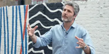
As a Creative Type Director in the Monotype Studio, Terrance Weinzierl has been creating and modifying typefaces for the Monotype Library and a wide range of brands since 2008. In addition to working on custom projects for PBS, Microsoft, Google, Barnes & Noble, Domino’s and SAP, he’s designed type for video games, professional sports teams and auto manufacturers.
