Save the Day with Fonts: A Recap of Adobe MAX 2019
James Fooks-Bale, Designer
Last week, thousands of designers, producers, and creatives descended upon Los Angeles for Adobe MAX, which brings together the creative community for hands-on workshops, inspirational keynotes, and updates on the latest in technology.
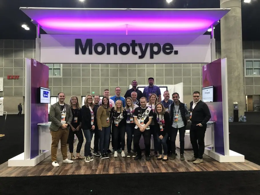
Monotype was very excited to be on hand as a sponsor. We used the occasion to launch our own new brand identity in a session called “Be the Hero: Five Ways You Can Save the Day with Fonts,” which was delivered by Monotype’s Charles Nix, Type Director, and James Fooks-Bale, Creative Director.
Typography is, of course, critical to any brand’s identity, but what often gets overlooked is the broader role it plays in tying together the full visual identity system. During the session, Charles and James shared techniques and real-life examples that demonstrate why a smart type strategy is more important than ever before. The full presentation is available through MAX Online, here are three steps the duo shared to help brands build and maintain a strong identity using type.
Find your visual voice.
Brands compete for attention everywhere they live, including new regions, emerging channels, and immersive environments. Maintaining consistency across a growing set of relevant touchpoints is critically important for brands, especially as consumers demand more from the organizations they choose to do business with.
As someone tasked with thinking through Monotype’s visual voice in market, James argued that a thoughtful font system is an important way to set the foundation for a meaningful identity. “
Why? For designers, there are 4 key ingredients that help build a brand:
-
Color
-
Shape
-
Type
-
Key Visual
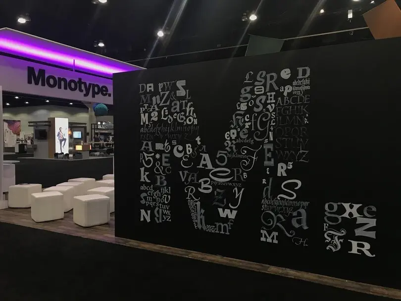
Both color and shape offer relatively limited options for differentiation, especially as many of the primary options are already assigned in the public consciousness. Type, on the other hand, provides comparatively limitless options, and relies on natural human instinct to generate recognizable differences. To test this theory, James showed the audience an image with a single letterform representing various enterprise brands, stripped from color and other visual elements. To most, many of the brands were still immediately recognizable.
As James noted, “the ability of our eyes to sort out the finest distances, symmetries, equalities, and inequalities plays a central role in our own perception of type. The personality, character, and I think at times sheer bravery of wordmarks keeps the brand world turning.”
Once a brand has become ubiquitous, it is possible for the key visual to stand alone, as has happened recently with examples like Mastercard and Starbucks. But type is the connective tissue that helps a brand maintain its core identity across channels.
Future-proof your core identity.
Building a brand identity is not a linear process, it requires constant evolution and attention. Gone are the days when a brand could be relatively static for 10-15 years. Today, there are new environments emerging daily, and expansion opportunities into new global communities are more available than ever before.
During the session, Charles and James explored the ways in which type can help set the foundation for a brand, while enabling expressions that are native to each new environment or region as they become necessary. Variable fonts represent an intersection of technology and design, and may be a key tool for brands looking to future-proof their identity. What are they? Essentially, a variable font is one font that can act as many, defining the boundaries of the type design space and then automatically interpolating the spaces between. The possibilities for what this technology can do within the brand world are fairly unexplored—in other words, open to the pioneers. As Charles said during the session, “they allow seamless, seemingly infinite choices of weights and widths.”
How do you apply font outlines that are more fluid to scales of communication, or outlines that can listen and adapt to the angle or levels of sunlight on your tablet or phone? The phones we carry every day are packed with sensors, including ambient light, gyroscopes, GPS, and accelerometers, not to mention our personal preference settings. Imagine connecting those data inputs to the outlines of the font for a more personalized experience.
Augmented and virtual reality (AR and VR, respectively) are also great examples of how fonts can help brands expand their core identity into new places. As these environments gain steam, brand designers will need to grapple with how to maintain consistency. After all, in a survey by Adobe, 71% of companies reported creating 10 times the number of assets as they did just a few years ago. We would expect that figure to continue going up.
Be different.
This may not feel like profound advice, but today’s brands must take a different approach to, well, being different. Retailers, for example, can no longer rely on standard buying patterns. In the age of Amazon, they must provide a more valuable experience to drive customers into the store. Consumer preferences are even changing how brands think about their role in society: 200 leading CEOs recently signed a statement saying corporations should no longer prioritize shareholder value above all else.
