


How do you choose a typeface when you’re the world’s biggest font foundry?
Monotype’s brand refresh needed to achieve the same consistency of communication that it champions for its customers. But what’s the answer when you’re a type foundry with literally tens of thousands of fonts to choose from, and multiple products and services to design for?
Choosing a new brand typeface is a huge decision for any company, but when you’re a font foundry, the question is a loaded one. It’s an even bigger challenge when you’re a brand like Monotype, needing to address a growing family of products and services – as well as a multitude of customer journeys, platforms and technologies. Over the last decade, the company’s continued growth and expansion into new global territories had made fresh demands on the existing typeface system – which no longer fit the needs of a brand this size. Having a suite of products with their own identities and brand equity had also contributed to a confused perception of what the company stood for, as well as a complicated customer journey.

As Monotype’s Senior Director of Creative James Fooks-Bale explains it: “We were all over the map, and not really delivering what we champion for our own customers: consistency and brand integrity. We needed to do more of what we were asking them to do. We needed to be the example.”
James Fooks-Bale, Monotype’s Senior Director of Creative.
The statistics back up Fooks-Bale’s point, showing that 23% of revenue growth can be attributed to brand consistency*, and that 64% of consumers are more likely to recommend a brand because it provides a simpler experience.**
As it stood, Monotype’s branding system had created a reputation for being traditional, corporate and complicated – instead of expressing the company’s commitment to innovation and expertise. A brand refresh would have to challenge these perceptions, as well as answer a long list of practical and creative demands.
The new brand typeface needed to cover legibility, readability, recognition and ease of use at any level. It had to work at multiple scales, to address everything from micro typography in UI environments up to huge type in events graphics and billboards. It also needed to speak to a wide range of customers across the world and do so confidently, regardless of their language or industry.
“We had to become the gallery,” explains Fooks-Bale. “We’re not the artwork. We had to take a step back, talk in a quieter voice, and let the product, the campaign, the type, the IP and the expertise live within that frame. You don’t want your branding talking louder than the typeface your client is trying to find.”
The answer to all these questions was, perhaps, inevitable.
As Type Director Charles Nix explains it: “If you were to be the largest purveyor of type in the history of the world and you were also, not coincidentally, the company that created Helvetica, renowned for its clarity, simplicity, and neutrality, how could you not choose Helvetica Now as your visual voice? It’s achingly obvious and perfectly suited to allow your chief ware, the glorious multitude of typographic choice, to take center stage.”

Monotype launched Helvetica Now in April 2019, as the next chapter in the story of what might be the best-known typeface of all time. Every single character in the typeface had been redrawn and re-fit, taking everything that’s so well-loved about Helvetica and updating it for the requirements of typography today.
Charles Nix, Type Director, Monotype.
“Years, thousands of hours and more than 20 people from the Studio team were involved in the specifications, design, production and marketing of the initial release of Helvetica Now,” says Vice President of Type Deb Gonet. “It was, and continues to be, a Studio team effort. Project managers, type designers, font engineers, and QE are all involved in a project like this, and with offices all over the world we are able to take advantage of the knowledge and expertise within the team regardless of location.”
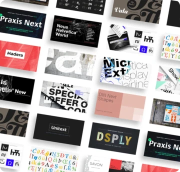
Helvetica Now was the starting blocks for Monotype’s brand typeface – a custom cut called Helvetica Now MT. But this wasn’t just a case of blindly selecting a font. The creative team built a matrix which allowed them to rank dozens of typefaces against key parameters such as legibility and readability. Next they begun testing typefaces in key customer-facing UI environments, to see how they would perform at small sizes as well as alongside other type.
“As a product designer on Monotype Fonts, I am constantly aware of our responsibility to behave like good curators inside a ‘gallery of type’,” explains Director of Product Design Jamie Neely. “When using our brand font in the UI, we are always searching for the appropriate volume to use (too quiet, too loud?). Helvetica Now has a nice way of fading into the background when we need it to… helping to support the discovery of the other fonts in Monotype Fonts.”

While Helvetica Now seemed the clear choice, building Helvetica Now MT wasn’t a straightforward adaptation. The typeface offered a huge range of options, meaning testing it in services such as Olapic and Monotype Fonts was essential for curating the design, and drawing out the elements that Monotype most needed. The later stages involved sharing various design iterations, to ensure the custom cut met the needs of product, UX, brand, marketing and development teams across the company. It also required working closely with Monotype designers that specialized in particular scripts, such as traditional Chinese or Japanese, in order to find fonts that would pair perfectly.

In late 2018, teams across multiple offices, and countries, began redesigning company websites as well as consumer-facing products, rebuilding them to respond to long-standing pain points and business needs and preparing them for the brand overhaul.
“Consistency is absolutely key to building trust in your users,” says Director of User Experience Lauren Moore. “Attention to detail and a unified experience lets the customer know you are putting them first and that you are focused on their needs.”
James Fooks-Bale, Monotype’s Senior Director of Creative.
As well as resolving issues, Helvetica Now MT allowed Monotype to pare its visual identity back to the absolute minimum. Thanks to its famed neutrality, the typeface lets the brand speak clearly and accessibly across everything it does - from marketing content to terms and conditions. That’s not to say it doesn’t offer room for expression. By selecting some of Helvetica Now’s alternate characters as defaults, such as the single-storey lowercase a, the creative team gently softened Helvetica’s no-nonsense approach. The square full stop has become a key design element, becoming shorthand for the simpler and more straightforward Monotype branding. “Everything needed to have a clarity and honesty to it, from the way we write to how we design,” says Fooks-Bale.

“It’s been fascinating to play with the optical sizes available in Helvetica Now,” adds Neely. “The Micro, Display and Text cuts all have a way of finding their own comfortable spaces - helping to accentuate the natural semantic differences between large emotional display type and tiny, pragmatic metadata copy.
”For some people, working with Helvetica Now MT has also had some surprising effects. Neely says adopting Extra Bold weights for large important text has encouraged the team to reconsider how they write copy, working to make more impact with fewer words, while Senior Designer Nicola Jones says she can’t remember the last time she used Helvetica in a website design, but found “little surprises and moments of delight” in working with Helvetica Now MT.

“I think it can be easy, as a designer, to feel that being given one specific typeface to work with as the main device of a brand is in some way restrictive or uninspiring,” she explains. “But if you know you are working with a well-designed, and in the case of Helvetica Now MT, curated typeface, it actually allows you the freedom to experiment with colour and layout, knowing that the typeface will stand as the backbone of your design.”
And while some might claim that Helvetica is the obvious choice, it’s exactly this that makes it feel so right. “Typography is the art that preserves all other arts and Helvetica is the most famous typeface of all time,” says Nix. “It’s known for its clarity, simplicity, and neutrality, which makes it the perfect foil for a company that showcases type. And it’s ours.”
Footnotes.
* The Impact of Brand Consistency, Lucid Press.
** Seigel+Gale, Brand Simplicity Index.


