Fonts and luxury brands: Beauty.
There are certain font characteristics which have traditionally been thought of as representative of luxury like serifs and high contrast strokes.
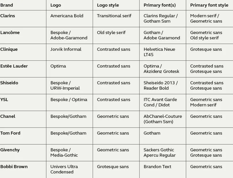
We wanted to do some research into the top luxury brands across beauty, fashion, and automotive to see which typefaces these brands are using and how. First up, the beauty sector – do all beauty brands really use Optima? We looked at ten of the top brands and found a few surprises.
Clarins
The Clarins primary typeface is a contrasted serif that is similar to Baskerville. An elegant typeface perfect for depicting beauty products. The brand uses a lot of white space with the Clarins font used for large captions and Gotham SmartScreen fonts for text and body copy.

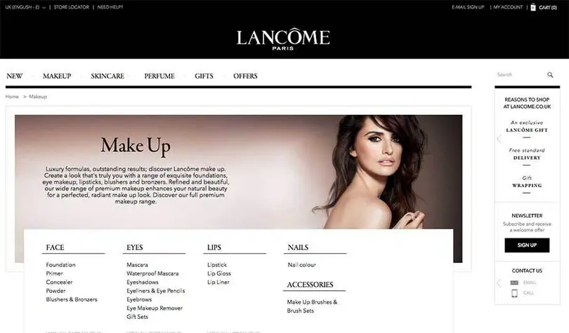
Lancôme
The high contrast theme continues with Lancôme. Hairline thin strokes on the version of Garamond in use depicts a sense of the highest quality. Garamond is set in all caps for the navigation bar on the website but upper and lowercase for large captions. Gotham is also used for body copy. The use of black expands the contrast theme and colour is sparsely used.
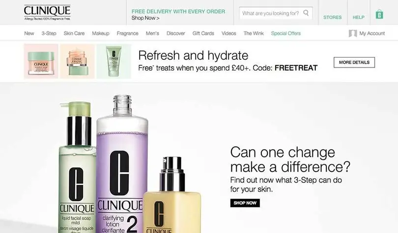
Clinique
Clinique has a unique style, their logo font is a wobbly serif called Jorvik Informal that is contrasted and quite unusual. Combining with Helvetica, space and pastel colours creates an unparalleled brand in the cosmetics industry. Clean, modern, fresh and stylish. Very simple but extremely effective.
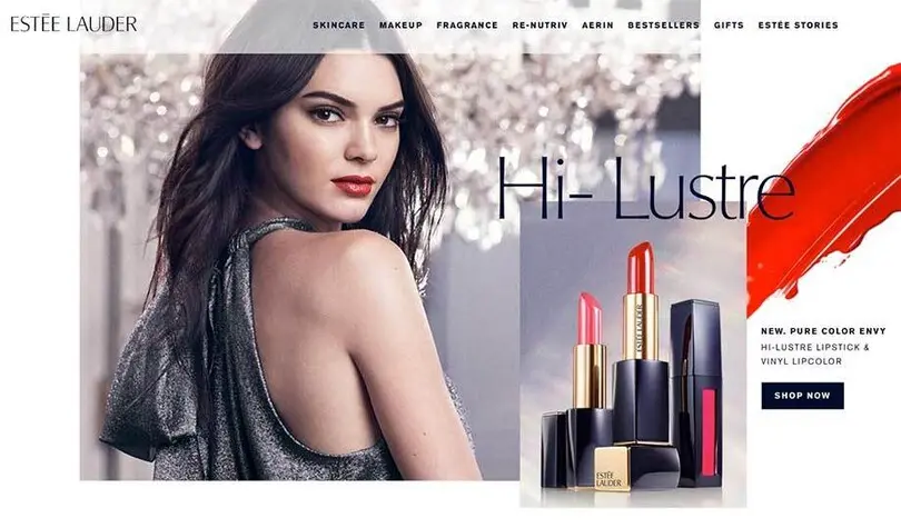
Estēe Lauder
Optima is a contrasted sans typeface that has elegance, style and is beautifully designed. Classic proportions, clear, legible, subtle and a tall x-height. Estee Lauder use the font in a light weight for added finesse alongside large imagery and a navy blue as their brand colour, giving a formal, serious but sophisticated feel.
Shiseido
Reader Bold is in the same vein as Gotham and is used in all caps for the navigation menu. Also using black on white as the theme. Bespoke font Shiseido2013 is used as body copy and small detailing and is like Optima in that it is a high contrasted sans with a large x-height, a large open counter and wide tone. We noticed some text alignment issues on their website including large gaps appearing in justified text, a confused mix of centred, justified and left aligned text and headings which don’t align with body copy.

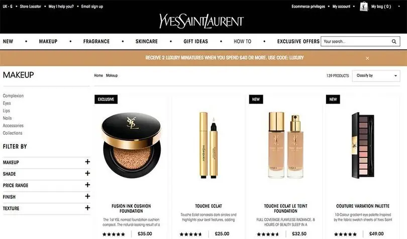
YSL
A departure from the usual over-used Gotham, ITC Avant Garde Gothic Condensed is a narrow closed typeface which is not very legible, the only beauty product researched with a narrow primary font. The ITC Avant Garde Gothic Standard version, a geometric and mono-linear, is used large and almost poster size creating a strong dominant feel which is not very complimentary to the logo or brand in the finesse sense.
Chanel
The strong, bold geometric sans set in all caps in the logo embodies elegance and class – synonymous with the Chanel brand. Using a renamed version of Gotham the brand typography doesn’t waver, everything is set in a bold weight with all caps, apart from the small body copy which is in Helvetica. The masculine and feminine sections are only separated by colour and imagery.

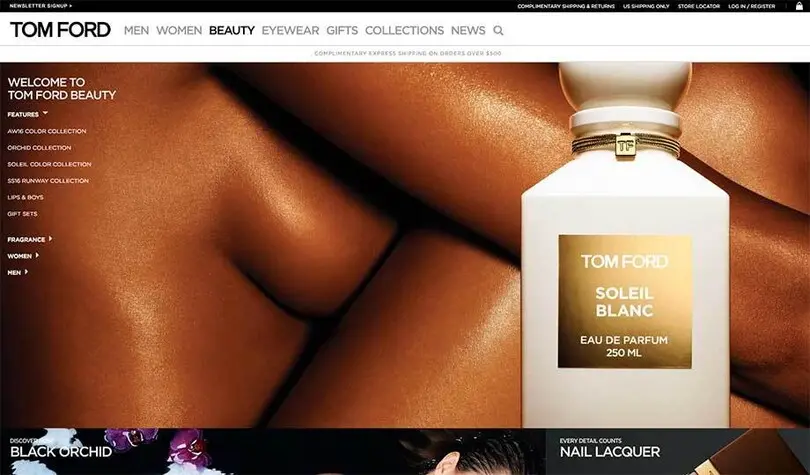
Tom Ford
On the Tom Ford website we can see all caps setting and a black and white theme again – no lowercase at all. Strong, bold and modern appeals to the younger markets with the need for a swagger and style. Very masculine and dominant.
Givenchy
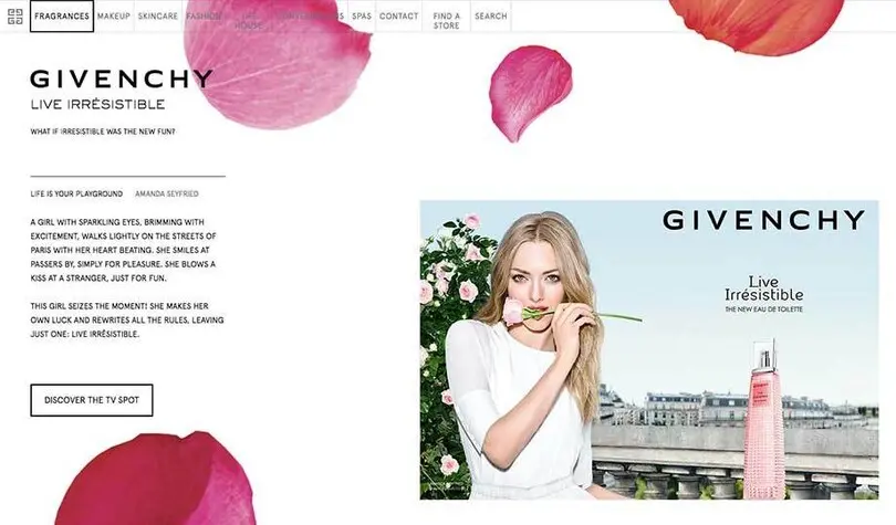
Givenchy is a luxury French brand known for creating chic and creative design styles. The brand is predominantly image based but all caps is used throughout their website for the captions and some text. Also, Sackers Gothic Light a wide all caps, mono-linear font displaying over stretched shapes. Apercu is mainly used in all caps too, a sleek grotesque sans with narrow proportions in contrast to the Givenchy squared emblem.
Bobbi Brown
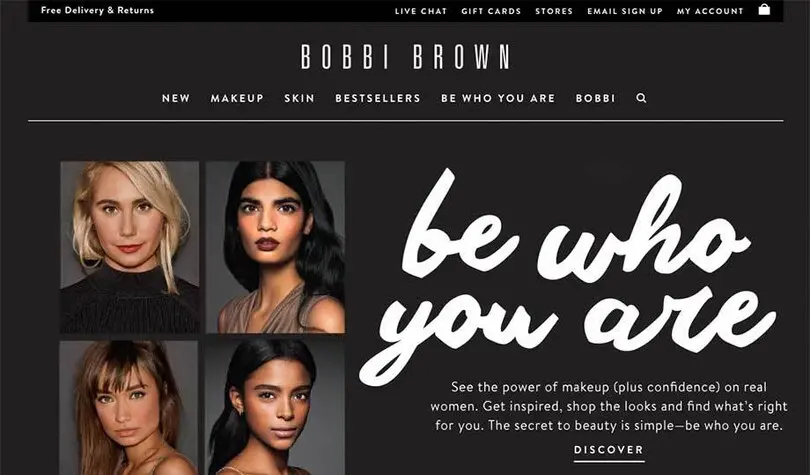
The Bobbi Brown logo is set in Univers Ultra Condensed and is the only brand to use narrow proportions in their logo. They use a lot of white space with black type and black borders creating a stark, harsh tone of voice. A loose hand script font that decorates some content lacks finesse as the bold shapes appear clumsy and undefined. Using Brandon Text a geometric rounded sans font adds a softness but looks slightly fuzzy at the sizes used.
Summary and trends
Bold elegance
There’s a misconception that beauty brands all use delicate hairline serifs, feminine color palettes and glamourous models in their imagery, but we’ve found a lot of monochrome, bold styles, and all capitals – not only for the logotypes but also website navigation and even body text. Text set in all caps poses many accessibility and legibility questions. Not only are they visually distracting but also appear to be shouting. It is very surprising to see some brands like Tom Ford using no lowercase at all on their websites, and it is less surprising but interesting to note that nearly every brand uses all caps in their logo. Just over half of the brands we looked at use a high contrast font in their logo (similar to Optima) – no surprise there - but the other 40% use a bold weight geometric or grotesque typeface, which gives quite a different feel. 40% also use a contrasted serif or sans as a primary font, and a massive 7/10 use a geometric.
Similarities
Gotham and high contrast sans Optima are the most prevalent, and it’s amazing to see how similar a lot of the brands are. Only three of the 10 brands are using a custom-made font (Shiseido, Clarins, and Chanel), which is surprising in a market where differentiation is vital and imitation rife. Using a ubiquitous font off the shelf gives no ownability and makes it very easy for smaller brands to mimic the look and feel.
Serif vs sans
The beauty market is clearly divided into those brands that strive for a sense of heritage with serifs and high contrast strokes and those with a bolder, more modern design using geometric and grotesque fonts. The latter can still achieve a luxurious feel by implementing good design practices and clean typography but might need to work a little harder to differentiate themselves from less expensive competitors. Although serif typefaces are usually thought of as synonymous with luxury, in this sector, they are quite rare (only 20% in logos and 20% of all primary typefaces). By using a contrasted serif, Clarins and Lancôme have created a distinctive brand image and a sense of heritage that separates them from the bold, robust, and strong-looking brands using sans serif typefaces. A contrasted sans serif can be just as elegant as a serifed font, if executed in the correct way – Estee Lauder using Optima is a clear example. Standing out from the crowd can be difficult in saturated markets, so the choice of typeface and the brand wordmark are vitally important. There is an opportunity in this sector to branch away from ubiquitous faces and achieve distinction from competitors alongside cheaper alternatives.
Fontsmith’s new luxurious typeface is called FS Siena, visit the font page to test drive.
