Fonts and luxury brands: Fashion.
Following on from our research into how fonts are used in the beauty and automotive industries, in part three we take a look at ten luxury fashion brands. What is the most fashionable font style? How do these brands use typefaces to stand out from competitors, and are there opportunities that are being missed?

Gucci
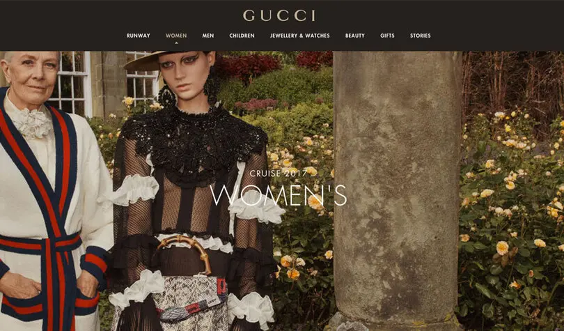
Large images and geometric typography create a sense of elegance, modernity and luxury. The use of Futura in body copy perfectly complements Granjon in the logo, both are wide, open, approachable and understated. The use of Times on item descriptions enhances the luxury feel, but is a free and unoriginal choice with hairline strokes which don’t hold up well at the small sizes used.
Tiffany & Co
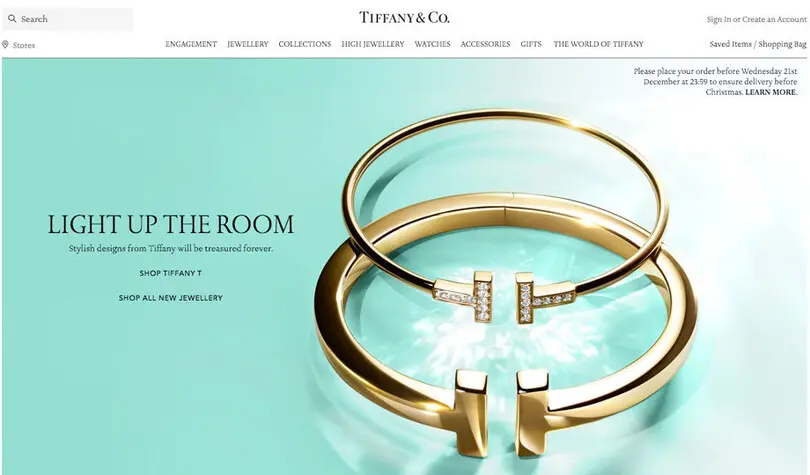
A high contrast, delicate serif typeface named Sterling by Hoefler Type Foundry is used in both the logo and as the primary font. Due to the wispy nature of the hairlined strokes the type disappears at small sizes especially on the navigation menu. Set in all caps for the menu and captions and upper and lowercase for body copy it looks luxurious and elegant. Humanist sans Avenir Next (and Helvetica) are also used in some sections offering a modern twist.
Jimmy Choo
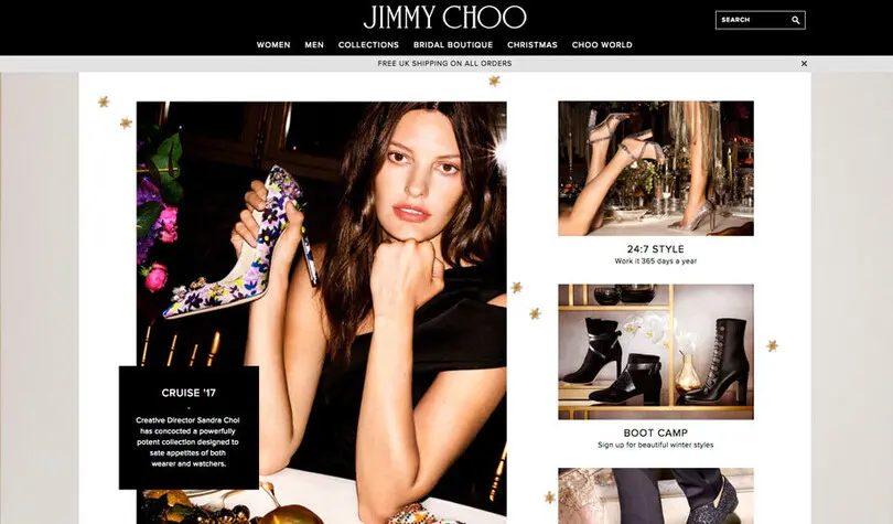
The contrasting narrow and wide nature of the bespoke University Roman JIMMY CHOO word mark allows the main typeface Proxima Nova to flourish, forming a dynamic visual relationship. Simple photography along with the clean, modern and legible Proxima Nova creates an elegant, classic and understated vibe.
Louis Vuitton
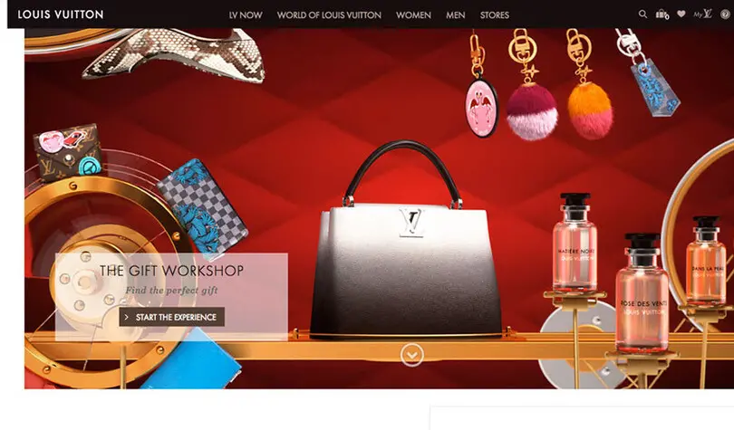
The bespoke ‘LV’ monogram has thick chunky serifs and weighted thin strokes. Based on the Georgia typeface it looks strong and robust. Futura is used for the ‘Louis Vuitton’ wordmark and text, creating a nice visual balance with the two typefaces offseting each other. On their website Georgia is also used for text, with Austin Roman and LV Clemence used sporadically creating a slightly confusing typographical hierarchy.
Dior
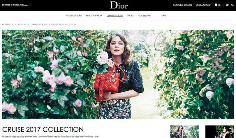
The Dior wordmark personifies elegance alongside the rich and dynamic full screen images which work well with the fonts to create a sense of style, class and sophistication. The supporting typeface is Century Gothic, with the captions set in all caps and the body copy in upper and lowercase. The use of Century Gothic Light makes the text appear grey which knocks it back. The website also uses system font Arial.
Prada
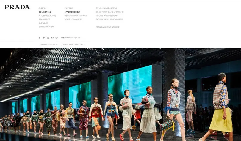
The Prada logo is a bespoke modern serif, which is bold, iconic and distinctive. The brand uses large moving images on their website that span the whole layout with minimal typography. The main nagivation menu is set in Univers all caps with the body copy set in a free open source font called Source Sans Pro. Prada have missed an opportunity to reflect their style in their typography which looks like an after thought.
Burberry
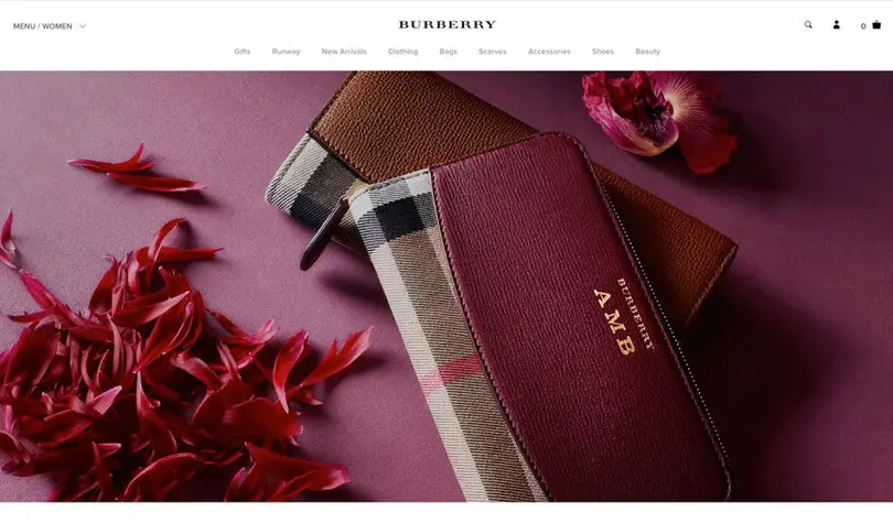
The Burberry logo is a bespoke expanded version of Bodoni, a modern serif style that conveys high quality and luxury. Proxima Nova is the primary font used for headings, caption settings and body copy in both upper and lowercase. A lot of the type (navigation and text) is small and difficult to read. The secondary typeface (Times), is another unimaginative choice that is free to use.
Armani
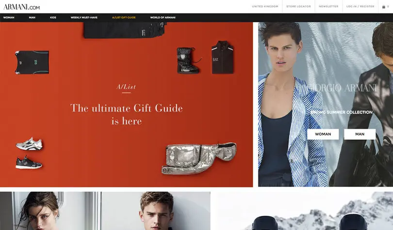
At times the hairline nature of the Armani Didot logo disappears but this typeface is a classic example of luxury, style and couture. Montserrat is a robust, open and harmonious geometric sans. Dark, masculine colours spread across the landscape and serious imagery. The brand is modern, classic and iconic – and the typography reflects this.
Manolo Blahnik
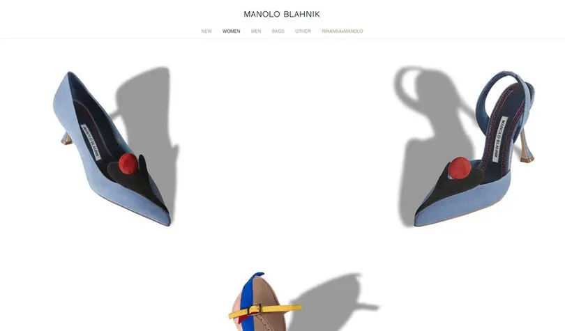
Manolo Blahnik have opted for Arial and it’s the only font used throughout. It looks very consistent, but Arial is a neo grotesque available on every single computer in existence so it’s a strange and unimaginative choice for such a high end brand. On the plus side many man hours were used to hint this font for screen usage so it is very functional. It has been set on a white background with lots of space to create a sense of sophistication. All caps have been used for headings and navigation alongside very luxurious imagery but the use of a core font is a wasted opportunity in terms of brand differentiation in this sector.
Dolce & Gabbana
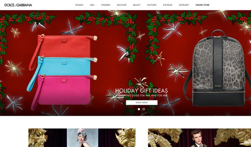
This brand is a mishmash of fonts with several different styles in use. As well as the geometric sans, transitional serif and humanist sans there’s a chalky handscript, and a Bodoni! A wild mixture of style and personality. The D&G logo is Futura Bold weight and has wide, round and geometric proportions. The lighter weights that are used in the navigation and caption convey a sense of grace and elegance but the lack of cohesion between Futura and Avenir lets this brand down.
Summary
Most of the brands contrast large, bold photography with subtle minimal typography. There are many similarities to the beauty sector where white space, bold colours, geometric and high contrast fonts are frequently used. Geometric sans serifs are very popular when it comes to the primary font choice and are used by 70% of the brands we looked at. Futura and Proxima Nova are the most popular compared with Gotham in the beauty sector. None of the ten brands we looked at are using a custom font and 40% are using browser safe typefaces like Times and Arial.
80% of the brands are using a serif typeface in their logo. Although this achieves a sense of heritage the hairline thin strokes can be very difficult to read, and don’t tend to render well on screen, especially at small sizes. When they were designed, digital usage may not have been a consideration but they don’t meet the demands of today’s applications.
Similar to beauty and cars, capitals are popular. Nine out of ten brands use all caps for their navigation menus and the same in their logo, Dior being the only exception.
Overall there is a tendancy to prioritise style over function alongside a surprising lack of imagination when it comes to typography. There are fundamental issues with type setting in terms of weight, colour and size. Many of the layouts simply aren’t legible on screen (eg Burberry, Tiffany, Dior and Gucci). The use of free fonts is common and in conflict with the luxury image. Brand is everything and although not every brand will see the value in having a bespoke typeface, by using Arial or Times there is no differentiation between high end or budget, especially on mobile where there is very little space for images.
