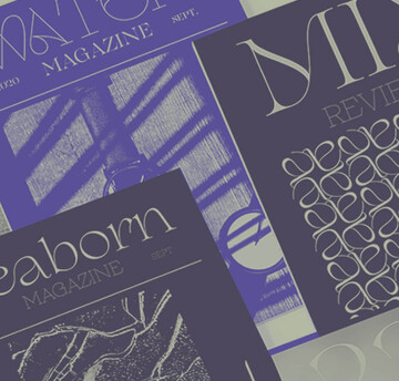
Luxury and typography: Elegance crafted in letters.

Some brands instantly make an impression with their distinctive visual identity. The iconic Burberry check, Gucci’s interwoven logo, and Louis Vuitton’s monogrammed suitcases are perfect examples of visual codes that have become timeless.
These elements, more than mere symbols, tell a story, convey values, and create an emotional bond with their clientele. Whether through colors, patterns, or lettering, these luxury brands have anchored their identity in the collective consciousness.
But what makes these elements so compelling?
How do design choices spark desire and foster a sense of belonging?
Typography: A key design element in luxury.
The typefaces or logo designs chosen by luxury houses are never random: they embody their values, history, and vision while reflecting their strategic positioning. Visual norms within the luxury industry are subtle yet refined, evoking timeless elegance, sophistication, and exclusivity. Over time they evolve, influenced by design trends and changing consumer expectations.
Take the geometric sans-serif logos that gained popularity in recent years for example. Brands like Burberry embraced this simplification before recently reverting to their original logo, demonstrating a desire to reconnect with heritage while responding to trends. These oscillations between modernity and tradition highlight the importance of remaining relevant and stylish while asserting uniqueness.
In this arena, standing out visually is essential. Every element, from lettering to logo, must convey a strong and distinctive DNA. A visual identity lacking uniqueness risks diluting the brand’s impact. Luxury houses understand this well: differentiation is not just an advantage — it is a necessity to exist in a saturated market.
Hermès: Balancing tradition and modernity.
Let’s start with Hermès, a brand that perfectly illustrates how lettering and visual identity integrate into a broader strategic vision. Introduced in the 1950s, the brand’s logo draws inspiration from Alfred de Dreux’s painting Le Duc attelé, groom à l’attente. More than just an emblem, it tells a story — one that reflects Hermès’ equestrian heritage through the carriage and horse, symbols of craftsmanship and aristocratic luxury.
When it comes to typography, Hermès has embraced a refined and understated approach. Its clean, minimalist lettering strikes a delicate balance between tradition and modernity. While the brand has historically used Memphis Bold, its website now features typefaces like Orator and Helvetica, reinforcing a timeless and universal aesthetic.
The logo seamlessly fits into a harmonious visual system, complemented by the brand’s iconic brown-edged orange box. This timeless design even earned Hermès the Oscar for Best Packaging in 1994. Today, the house goes a step further, incorporating eco-conscious design into its packaging — demonstrating a commitment to blending luxury with environmental responsibility.
Hermès store front

New Bugatti logo wheel

Bugatti’s progressive luxury.
Bugatti distinguishes itself among brands that have recently excelled in visual identity. The renowned automotive brand has completely redesigned its graphic identity, adopting a sleek design that reflects the innovation and performance at its core.
The introduction of a new, refined typography — created by typographer Thomas Huot-Marchand — draws inspiration from old French street signs and the brand’s photographic archives. A powerful new logo, with pronounced serifs, features a reversed ‘E,’ echoing the founder’s initials. A revamped Bugatti blue palette and a new photographic direction have reinforced Bugatti’s image of technological and timeless luxury. Crafted by design agency Interbrand, the revamp achieved resounding success, earning the prestigious Red Dot Design Award in recognition of excellence across all aspects of design.
This example illustrates how a meticulously crafted visual identity can propel a brand by conveying strong values and a hyper-luxury positioning.
The emotional impact of typography.
In the world of luxury, brand identity is a meticulously orchestrated experience where every visual and narrative detail plays a key role in crafting an emotional connection with consumers. Typographic choices profoundly influence how brands communicate their values of exclusivity, timeless elegance, and innovation.
A study conducted by Monotype and Neurons in 2021-2022 demonstrated that typography acts as a strategic lever in brand perception, directly affecting key attributes such as trust, perceived quality, and innovation.
Heritage and sophistication: Classic serif fonts.
Serif fonts, such as Cotford Display Regular, draw from classical models like Caslon or Baskerville. These fonts, often associated with industries like fashion, luxury, and publishing, evoke a sense of seriousness and timeless sophistication. The study linked this type of typography to a 13% increase in perceived quality and a 9% boost in reliability. This impact stems from their cultural association with traditional elegance and artisanal excellence. Brands like Hermès rely on these visual codes to weave a strong connection between heritage and innovation.
Modernity and authenticity: Sans serif fonts.
On the opposite end of the spectrum, humanist sans-serif fonts, such as FS Jack, inspired by calligraphy, stand out for their ability to reinforce attributes like authenticity and approachability. These typefaces enhance the perception of innovation by 9% and strengthen values such as sincerity (+10%) and honesty (+5%). By balancing modernity with a touch of humanism, they enable brands to forge an emotional connection with their audience while cultivating a lasting sense of belonging.
Geometric sans-serif fonts, like Gilroy Bold, play a crucial role in advertising and digital media. Their simplicity and legibility increase message memorability by 6% and improve perceived competitive advantage by 12%. With their minimalist and functional aesthetic, these typefaces convey a captivating modernity — ideal for slogans or visual campaigns projecting innovation and dynamism.
A game of desire: Limited editions and exclusive collaborations.
Beyond visual identity, luxury brands foster desirability by transforming the unattainable into something tangible through unique collaborations and limited editions
For instance, Dior collaborated with the foundry Violaine & Jérémy to create a custom typeface for its Mitzah scarf collection. This refined typeface reflects the house’s sophistication, blending timeless elegance with a contemporary touch to enrich the visual universe of its silk textiles.
Similarly, Liberty Fabrics partnered with Pentagram and Colophon Foundry to reinterpret its typographic heritage. Together, they designed Lazenby Sans, a font inspired by the historic signage of its Great Marlborough Street department store. Used for bold, kaleidoscopic patterns, it merges tradition and modernity, embodying the brand’s eccentric spirit through a fusion of heritage and technology.
These collaborations transform the act of purchasing into a sensory and emotional experience. Each product becomes a fragment of an idealized universe, where the object turns into a totem of desirability and belonging.
Pentagram in collaboration with Colophon Foundry : Lasenby Sans


Timeless stories crafting emotions.
Visual identity embodies the soul of luxury, weaving together tradition and modernity. Through subtle typographic choices, timeless graphic codes, and bold collaborations, luxury houses inscribe their uniqueness into eternity.
In a saturated marketplace where identities blend into one another, these brands remind us that standing out is vital. Beyond merely offering products, they craft stories to be lived, emotions to be felt, and dreams to be shared. It is in these narratives, woven from desire and belonging, that the magic of luxury resides.

Fonts and luxury brands: Cars.
In part two of our research into the luxury sector and how font styles are used, we look at automotive brands. Still thought of as a masculine dominated industry we were interested to see if there were any similarities with our last study which was focused on the beauty sector.

Fonts and luxury brands: Beauty.
There are certain font characteristics which have traditionally been thought of as representative of luxury like serifs and high contrast strokes. We wanted to do some research into the top luxury brands across beauty, fashion, automotive and travel to see which typefaces these brands are using and how. First up the beauty sector – do all beauty brands really use Optima? We looked at ten of the top brands and revealed a few surprises.

Fonts and luxury brands: Chapter three fashion.
Following on from our research into how fonts are used in the beauty and automotive industries, in part three we take a look at ten luxury fashion brands. What is the most fashionable font style? How do these brands use typefaces to stand out from competitors and are there opportunities which are being missed?

Creative Characters S3 E16: What our emotions can teach us about design and branding.
This week, we dive into Monotype’s scientific research on the emotional power of typography. Marie Boulanger, Senior Brand Designer at Monotype, joins as a guest and shares some of the thinking, methodology, and insights behind the global studies. Tune in for more.

The Neuroscience Behind the Emotional Power of Typography at Brand Talks London.
Marie Boulanger, brand designer at Monotype, presented at Brand Talks London in November 2022, giving an overview of our ongoing research into the neuroscience of typography.
![[Webinar]: The science behind the emotional impact of type.](/sites/default/files/styles/380x190/public/2022-05/Monotype%20x%20Neurons.-low.gif?itok=I-ST9WUK "[Webinar]: The science behind the emotional impact of type.")
[Webinar]: The science behind the emotional impact of type.
Can fonts influence our response to taglines and slogans? Can they encourage us to perceive a company logo in a more positive way? Do they really build trust between brands and consumers? Watch our webinar to learn more.