
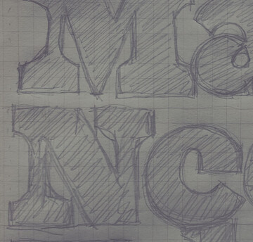
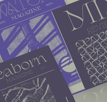
Font Legibility

Behind the font highlights the people and process behind the fonts you love and use. This installment features Carl Crossgrove of the Monotype Studio.

Retail customers are scattered across a wide range of touchpoints and react with them all interchangeably. However, they’re all linked through the mobile experience.

In this feature from the Recorder, issue 2, we speak to the Swiss designer about how his natural aversion to authority has played a role in his approach, and how his work aims to break the boredom of everyday design.

Setting text in augmented and virtual reality presents new design challenges. Learn about six fonts that can enhance your AR/VR creations.

Tom Rickner, veteran type designer, shares his personal role in the beginnings of type’s most exciting development in decades.

Absorbing information quickly is more than a convenience at 60mph. Fonts for cars must emit visual appeal and brand consistency, while being exceptionally legible and readable at a glance. This collection illustrates a sampling of typefaces that can be read easily to help keep drivers’ eyes where they belong — on the road.

In an industry where scams are commonplace and no brand is immune, trust is fragile. So, how can financial institutions build it, and build it to last?

Consumers are increasingly demanding connectivity in their vehicles, and are prioritizing in-car technology that enhances the driving experience.
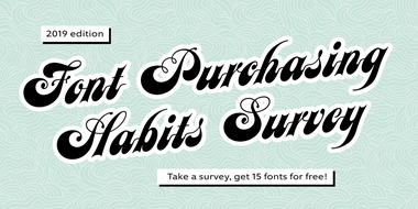
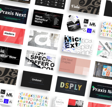
How much are designers willing to pay for high-quality fonts? Are variable fonts ready for showtime? These are among the mysteries this annual survey seeks to unravel.
Adobe MAX is right around the corner! Here’s a quick look at what we have planned for this year’s conference.

The idea of brick and mortar stores has been a hot topic lately. Are they dying? Thriving? Whatever you believe, they’re changing, with an eye toward digital.

With the emergence of variable fonts, design no longer has to be traded for page speed. See how this new technology can transform how we think about web design.

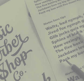
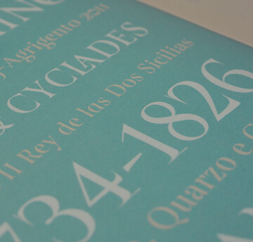
Optical sizing has long been part of the type designer’s toolbox, but for many people the term may not be familiar. Here’s why that should change.

The SST font tackles a central challenge of branding – universality. The SST superfamily supports more than 90 languages including Japanese, Thai and Arabic.

Monotype introduces Ambiguity, a typeface designed to effectively express a range of attitudes and beliefs.
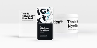
Designers and studios might be deeply familiar with Neue Helvetica, but it’s the product of a pre-digital era. Here are four reasons why it’s time to switch.
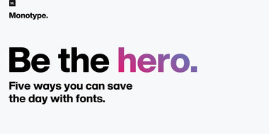
As technology raises the stakes for brands, fonts can either level you up or hold you back. A simple, well-organized font system is essential to making sure you can keep pace.

The World Cup is back, and all eyes are zeroed in on the best football … jersey fonts? We examine the tall task of designing for the world of sport.