


Studio
Tag: Studio
18 articles
See how we helped Duolingo find its voice (and its wings) with a custom brand font.

A letter is more than the sum of its parts, but sometimes it helps to know what those parts are called. And it may not surprise you to learn that in a field as meticulous as typography, every little piece of a letter has a name.

Fontsmith's roster of typefaces, along with its years or experience and expertise, are part of the Monotype library and available for all Mosaic customers.

MotoGP™ is the top division of the FIM Road Racing World Championship Grand Prix. It’s the oldest motorsports championship (racing since 1949) and visits a total of 16 countries across four continents every season.

The city of Dubai partnered with Microsoft and Monotype to create a typeface that reflects Dubai’s energetic nature in both Latin and Arabic.

Fonts are more than a pretty face. Underneath their polished surface is an intricate array of data and functionality that few people ever see. Yet this hidden world is integral to the reliability, performance and appearance of a font.

We’ve long admired the incredible work of Fontsmith Founder Jason Smith and his team of designers, and we’re proud to welcome them to the Monotype family.

Out of all the thousands of fonts in the world, handwriting fonts are a category unto themselves. But even within that seemingly narrow niche, there is a range of styles that reflects the variations and subtle differences found in actual handwriting.

From alternates to X-height, this list of typography terms and definitions covers just about everything you'd want to know about fonts and typography.

“Typeface design is not an art. It’s a craft,” says Marco Ganz, the designer of Veto Sans. “People are familiar with letters. Letters have a purpose. Art has no purpose beyond making people think or wonder.”

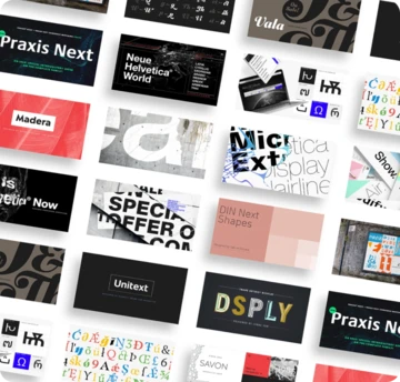
Monotype’s brand refresh needed to achieve the same consistency of communication that it champions for its customers. But what’s the answer when you’re a type foundry with literally tens of thousands of fonts to choose from, and multiple products and services to design for?

UK Type Director Tom Foley discusses how today’s brands can deliver stunning, impactful creative work--if they can get everyone on the same page.

We’d like to introduce the newest member of the Monotype team, Tom Foley. As Creative Type Director, Tom will lead the Studio team in London.

Helvetica® is perhaps the best-known typeface of all time, inspiring designers across multiple generations and around the world. Recently, Monotype’s Studio team released Helvetica® Now, a reimagination available in three optical sizes - Micro, Text, and Display. Every character has been redrawn and refit; with a variety of useful alternatives added.

Designers from several leading brands share their own experiences with Helvetica®, and discuss why Helvetica® Now is suited for the needs of a modern world.

The National Football League has a long history of memorable logo design. We asked the Monotype Studio team to share their favorites, both contemporary and from childhood.

Imagine inventing a brand new written alphabet. How would you do it? What challenges would you face adopting it for digital use? That is the story of Adlam.

Placard Next is a reimagined version of a 1930s poster design, that takes all the original quirky details and refines them for digital use. Its condensed versions pack an instant typographic punch when used at large sizes, introducing some unusual flavor to posters, headlines and anywhere else designers need to make a statement.