Creative Characters S4 E12: From Parsons to Type Thursday: a conversation with Thomas Jockin.
This week on Creative Characters, host Charles Nix sits down with Thomas Jockin, the founder of Type Thursday, a global type meetup. Tune in for an interesting look at the intersection of type design, education, and community-building.
Creative Characters S4 E11: Kyle Read on the art (of the business) of type design.
Host Doug Wilson sits down with his long-time friend, Kyle Read, a distinguished type designer and graphic designer based in Denver, Colorado. Kyle shares his journey from studying at the Savannah College of Art and Design, working for various design studios and advertising agencies, to founding Badson Type Foundry. Tune in to hear Kyle’s story.
Dingbats beyond Wingdings Part 2: Zapf Dingbats, Webdings, Emoticons & Emojis.
Inspired by a conversation with the power-couple in typography who blessed the world with the Wingdings font families, we bring you a two-part deep dive into all things dingbats.
Dive into Dingbats Part 1: Interview with Wingdings creators.
Inspired by a conversation with the power-couple in typography who blessed the world with the Wingdings font families —Kris Holmes and Charles “Chuck” Bigelow—we bring you a two-part deep dive into all things dingbats. Here, in Part 1, we unpack dingbats with a focus on Wingdings; In Part 2, we look at “Dingbats beyond Wingdings: Zapf Dingbats, Webdings, Emoticons, and Emojis”.
Behind the Font: Font Licensing, demystified (Part 3 of 3).
In part 3 of Behind the Font, our Senior Vice President and Assistant General Counsel, Phil Carey-Bergren, and host, Carl Unger, discuss the implications of breaching font licenses, the significance of copyright, and what to do if you accidentally breach a contract or misuse a font license. Tune in now.
Behind the Font: Font Licensing, demystified (Part 2 of 3).
In part 2 of Behind the Font, our Senior Vice President and Assistant General Counsel, Phil Carey-Bergren, and host, Carl Unger, dissect the main parts of a font license and walk us through some common font licensing use cases you might see at work. Tune in now.
Behind the Font: Font Licensing, demystified (Part 1 of 3).
In the first-ever edition of our new podcast miniseries series Behind the Font, we dive in to the often murky and mysterious waters of font licensing. In part one, we get a crash course in recent font history to understand how licenses have evolved and why this matters to today’s brands, designers, and agencies. Tune in now.
Font management: Common digital challenges and how to fix them.
It’s well-known that font related issues can have a dramatic impact on your creative workflows, creative output as well as your admin teams. Lesser known, but just as important, is the impact fonts can have on your internal IT, as well as the digital experience you’re offering as a brand.
Two roads to procuring fonts: Online vs offline.
If you want to go fast, go alone; if you want to go far, go together. Accompanying you on your company’s branding journey, this guide is designed to support you as you decide which path to take when it comes to font license acquisition.
Elevate your Brand: 4 Simple Design Strategies with Proven Results.
Design choices might seem superficial — but clear, engaging brand systems deliver significant impact for small businesses. A strong visual identity can give you an advantage by telling a clear story about your products or services and convincing customers to convert. Ultimately, effective design delivered consistently across key touchpoints can help you:
5 common font management issues Monotype Fonts will help you fix.
Let’s look at some common font issues you might have already come across, and how Monotype Fonts can help you resolve them.
5 tips for facing a challenging font licensing gap.
There’s something empowering about being a problem-solver. In the case of fonts, that often means being the one to resolve font license gaps. Everyone at your organization uses fonts, after all, and you have the chance to say, “I got this. I’ll make sure our creatives have the right tools so they can design with confidence.”
Evolving with the types: When to update your font solution.
Usually, if it ain’t broken, don’t fix it. But when it comes to vessels carrying precious cargo, be they vehicles, bodies or fonts, maintenance checks are imperative for avoiding a crash. We usually get a clear signal when something isn’t right. With a car, you might have a “check engine” light, while aches and pains tell us when something’s not right with our bodies, but with fonts, its not always obvious when something’s wrong. Unless you know where to look, that is…
Font licensing & management terms and definitions.
From servers to desktop, this licensing lexicon covers terminology related to font licensing. While these definitions are applicable to licensing fonts in general, all examples given are related to Monotype font licenses specifically. Always refer to the relevant EULA to understand more accurate definitions for a software license.
Font licensing principles unpacked.
What is the difference between a typeface, a font, a font file, a font license, and a EULA? Does a font license cover one or multiple fonts? What informs a font license strategy? What’s the easiest way to resolve a font license gap—before or after it arises? From fundamental principles to pre-purchase considerations, this guide aims to help you confidently speak the language of fonts.
Monotype Fonts: 5 Features that make font management a breeze.
Have you just had a font problem fall into your lap, and you’re looking at how to solve it? It’s confusing, we get it. Whether it’s administering font licenses, issues with file storage, or redundant back and forth to grant user access… With so many opportunities for something to go wrong, unclear font management can cause some serious headaches. Bet you wish you had a personal assistant to help keep track of it all.
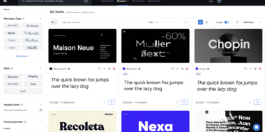
Monotype Fonts: Our font library structure explained.
You’ve heard about our font library; you may even have tested it out – but you’re still unsure whether it’s right for you and your team? We get it. Any choice should be informed especially when it comes to business, so we thought it might help to delve a little deeper into certain aspects of the platform and look at how they really make the difference for brands like yours.


