Fonts.
This ebook takes a look at the evolution of font design to illustrate why today’s brands need fonts optimized for the customer experience. The eBook gives examples of how new fonts are created (and old favorites are reimagined) to handle the demands of modern technology, so you can ensure the font you choose for your brand won’t let you down.
Maintaining good brand health and a strong visual identity is essential to developing trust with your customers. It also requires constant focus and a willingness to adapt and experiment on the fly. We’ve highlighted areas you can’t ignore if you want to deliver the experience consumers expect.
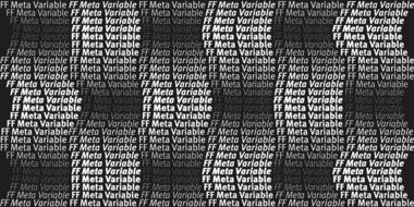
Typography on the web has long been considered second to web page performance, leaving web designers unable to apply all but the most basic typographic principles to online content. Until now. With the recent emergence of the variable font format, designers can work with an entire font family as they do in print.
Choosing a typeface to represent a brand’s voice isn’t an easy decision, and it becomes more complicated when companies have to factor in the future. Type offers brands an immense amount of value, but it needs to be able to stretch.
Much like people, typefaces are multifaceted. They can be practical and straightforward, or they can be expressive and full of contrast, depending on how they’re used. Making the most of a typeface means knowing how to unlock its secrets.
Monotype’s brand refresh needed to achieve the same consistency of communication that it champions for its customers. But what’s the answer when you’re a type foundry with literally tens of thousands of fonts to choose from, and multiple products and services to design for?
Pairing typefaces is one of the more challenging tasks a typographer faces. This installment of Good Type examines the different ways designers can pair fonts.
In this three-part series, we’ll show you how fonts can help your website follow the standards established by the Americans with Disabilities Act.
In this three-part series, we’ll show you how fonts can help your website follow the standards established by the Americans with Disabilities Act.
A good typographic system is like a family—and just like people, it comes in all shapes and sizes, allowing it to address a range of design requirements.
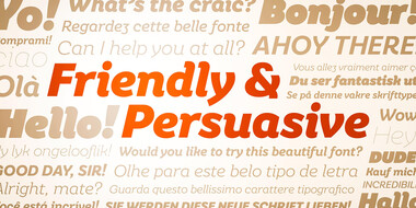
When it comes to the display fonts, there’s more freedom to experiment and play. Not just with the type itself, but with people’s expectations.
Conveying a clear message means using a typeface that’s effortless to read. This installment of the Good Type series examines which factors affect readability.
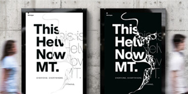
Helvetica® is perhaps the best-known typeface of all time, inspiring designers across multiple generations and around the world. Recently, Monotype’s Studio team released Helvetica® Now, a reimagination available in three optical sizes - Micro, Text, and Display. Every character has been redrawn and refit; with a variety of useful alternatives added.
Designers from several leading brands share their own experiences with Helvetica®, and discuss why Helvetica® Now is suited for the needs of a modern world.
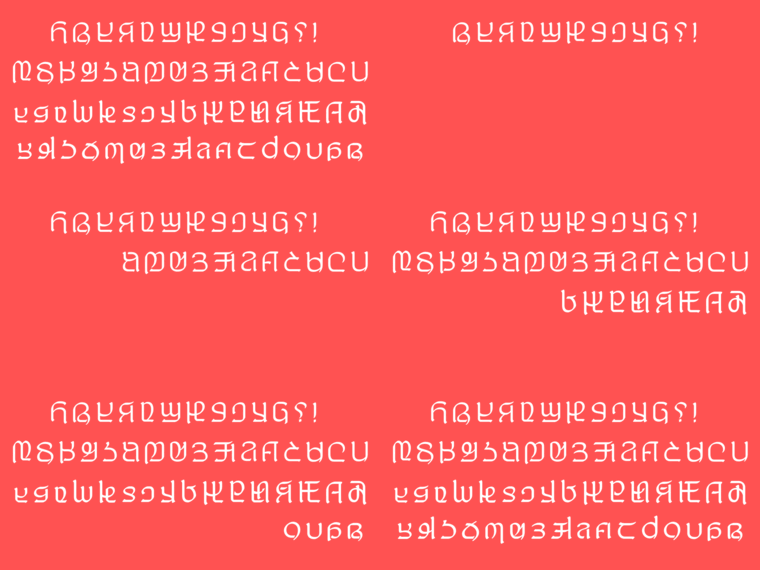
Imagine inventing a brand new written alphabet. How would you do it? What challenges would you face adopting it for digital use? That is the story of Adlam.
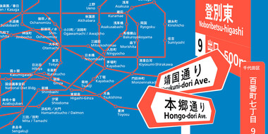
Monotype unveiled a new glyph design for its popular Tazugane Gothic and Tazugane Info typefaces that commemorates the new emperor of Japan.
Typeface design is a mysterious business. While most people are acquainted with the dropdown menu in Word or a website like MyFonts, not everyone realizes there’s a host of independent designers and foundries all quietly making their contribution to visual culture.
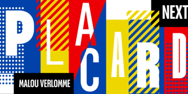
Placard Next is a reimagined version of a 1930s poster design, that takes all the original quirky details and refines them for digital use. Its condensed versions pack an instant typographic punch when used at large sizes, introducing some unusual flavor to posters, headlines and anywhere else designers need to make a statement.

