Featured article.

Let’s look at some common font issues you might have already come across, and how Monotype Fonts can help you resolve them.
Let’s look at some common font issues you might have already come across, and how Monotype Fonts can help you resolve them.

Long gone are the days of zipping up folders of font files and sharing them across your organization, or even messier, embedding fonts in documents in the cloud in hopes that the design remains intact. We recently announced an expanded set of licensing rights which allows all employees within an organization to access Commercial Production Fonts in their desktop environments.

This week we’re welcoming Andrew Krivine, author and punk rock collector, alongside Michael Worthington, faculty at CalArts and co-founder of Counterspace. The creative duo is here to tell the tale of how they co-created the largest exhibition of punk and new wave graphics ever shown on the West Coast.

Over the past four years, we’ve been lucky to forge a reciprocal partnership with the Limerick School of Art & Design / TUS in Ireland. Both Creative Type Directors Tom Foley and Emilios Theofanous have now participated in workshops and modules at the leading fine art, design and creative media school. This year’s students were asked to write a message platform for one typeface and build a marketing plan and design assets to promote it in digital or print media.

Rebranding a business is not for the faint of heart. It’s an enormous operation that requires significant time and investment while offering the possibility of totally revitalizing a brand.

Legibility is a crucial consideration when trying to choose a font for your project. Here’s how to find a legible font that will be easy on the eyes for your readers and customers.

Launching a website or app? Your font choice is key to your success. Here’s how to assess the legibility, consistency, performance, and longevity of your font choice.

Find design inspiration in an age of information overload.

In this article, get a peek at recent and upcoming book releases in a variety of genres to get a sense of what typography styles are trending in publishing right now. This post is a guest piece from our friends at Reedsy, a website that connects authors with publishing professionals.

Today’s brands must keep up with a fast-paced digital world and navigate a “new normal” that’s still emerging from the worst of the pandemic. The last few years shifted everyone’s digital expectations, how brands operate, and in some cases, impacted their business models.
Brand Talks Connected delivers Monotype’s popular Brand Talks event series directly to wherever it is you’re working these days. Here’s a look back at some of the amazing content from 2020. We hope you’ll join us for the next event!
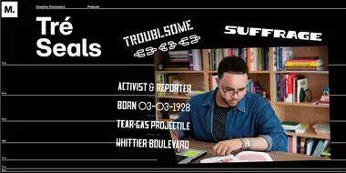
In episode four we talked with Tré Seals, founder of Vocal Type, about his efforts to break down stereotypes in design and how a middle-school side gig, born out of a brush with serious childhood medical issues, helped him become the artist he is today.
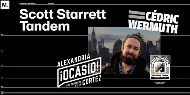
In our second episode, Monotype Creative Type Director Charles Nix talked with Scott Starret, co-founder of the design studio Tandem NYC, about serendipity and the experience of designing for a transformational political candidate.
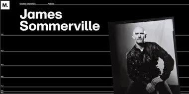
In our first episode, we talked with James Sommerville, co-founder of KNOWN_UNKOWN, about his ideas for the future of creative work, community, and work/life balance in a post-pandemic world.
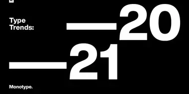
After a year like no other, and with an ever-changing future ahead, it is truly an exciting time for the creative industry. Join Charles Nix and Phil Garnham from the Monotype Studio for an in-depth look at the typographic trends that have emerged from this experience.
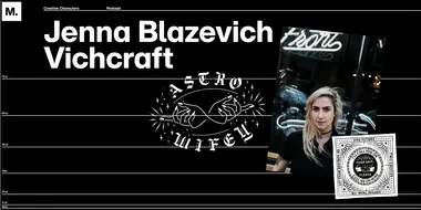
In episode three we talked with Chicago-based lettering artist Jenna Blazevich, about chain stitching, punk rock, intersectional feminism, and whatever the heck Malört is.
Creative Type Director, Tom Foley, sat down Antalis Creative Power to discuss the 2021 Type Trends report, the state of Sans Serif, and consider what makes a font timeless in his latest interview.
First published on Antalis Creative Power

Pablo Amade, Creative Director for SUMMA Branding, presents his Correos case study at Brand Talks Connected – EMEA on November 18, 2020.
At Brand Talks Connected – EMEA on November 18, 2020 SUMMA Branding’s Creative Director Pablo Amade and Monotype Senior Type Designer Emilios Theofanous discussed developing a font for Correos, the Spanish postal service.