Featured article.

Let’s look at some common font issues you might have already come across, and how Monotype Fonts can help you resolve them.
Let’s look at some common font issues you might have already come across, and how Monotype Fonts can help you resolve them.

Long gone are the days of zipping up folders of font files and sharing them across your organization, or even messier, embedding fonts in documents in the cloud in hopes that the design remains intact. We recently announced an expanded set of licensing rights which allows all employees within an organization to access Commercial Production Fonts in their desktop environments.

This week we’re welcoming Andrew Krivine, author and punk rock collector, alongside Michael Worthington, faculty at CalArts and co-founder of Counterspace. The creative duo is here to tell the tale of how they co-created the largest exhibition of punk and new wave graphics ever shown on the West Coast.

Over the past four years, we’ve been lucky to forge a reciprocal partnership with the Limerick School of Art & Design / TUS in Ireland. Both Creative Type Directors Tom Foley and Emilios Theofanous have now participated in workshops and modules at the leading fine art, design and creative media school. This year’s students were asked to write a message platform for one typeface and build a marketing plan and design assets to promote it in digital or print media.

Rebranding a business is not for the faint of heart. It’s an enormous operation that requires significant time and investment while offering the possibility of totally revitalizing a brand.

Legibility is a crucial consideration when trying to choose a font for your project. Here’s how to find a legible font that will be easy on the eyes for your readers and customers.

Launching a website or app? Your font choice is key to your success. Here’s how to assess the legibility, consistency, performance, and longevity of your font choice.

Find design inspiration in an age of information overload.

In this article, get a peek at recent and upcoming book releases in a variety of genres to get a sense of what typography styles are trending in publishing right now. This post is a guest piece from our friends at Reedsy, a website that connects authors with publishing professionals.

Today’s brands must keep up with a fast-paced digital world and navigate a “new normal” that’s still emerging from the worst of the pandemic. The last few years shifted everyone’s digital expectations, how brands operate, and in some cases, impacted their business models.
With seemingly every business in the world launching apps, online services, and other digital properties, many brands are likely wondering how they can stand out from the digital noise.
We’re very excited to share that Monotype has agreed to acquire URW Type Foundry, a subsidiary of Global Graphics PLC. Based in Hamburg, Germany, URW is an innovative font and software provider, with extensive experience in designing and engineering fonts to service the needs of global brands. We’re proud to welcome the team to the Monotype family.
Brands today are connecting with customers across countless touchpoints – from LED billboards, to smartwatch apps to magazine ads. This provides countless opportunities for graphic designers and creative professionals to work on exciting projects, but designing for multiple environments at once has its challenges, too.
Perhaps the biggest challenge is not figuring out how to return to whatever “normal” used to look like, but how to let go of the vision we held for the future we thought we’d have.
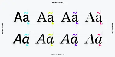
Font superfamilies are vast collections of type that can meet a multitude of needs without compromising on consistency. But what defines a superfamily, exactly?
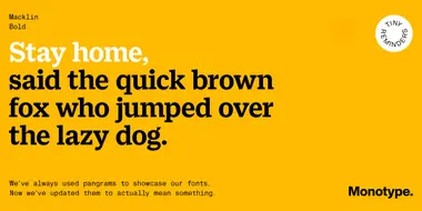
Typography is an important component of great design. And for designers, selecting the right type can be an enormous challenge with so many varying styles and weights to choose from. To help, pangrams are often used to quickly get an overview of what a particular font looks like in use.
TypeNotes is a love letter to letterforms, a journal dedicated to typography and graphic design.

Fonts in games have a subjective role, helping to convey the theme and atmosphere of a game while shaping expectations about its content. And there’s the more practical job of conveying information quickly, legibly, on any kind of screen and in multiple languages, so that no one gets left behind or in the lurch.
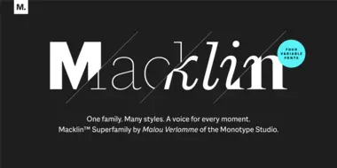
Malou Verlomme’s Macklin superfamily is a gently irreverent take on the display type of the late 19th century, with an elegant twist that updates these letterforms for modern use. Choose one style, or use the entire variable family as a type toolbox.