
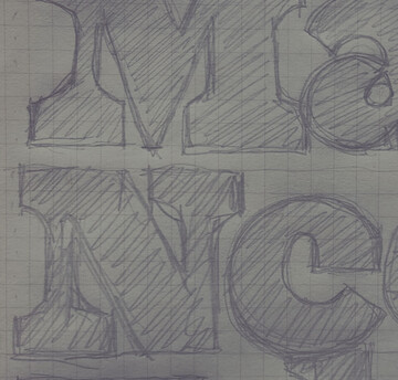
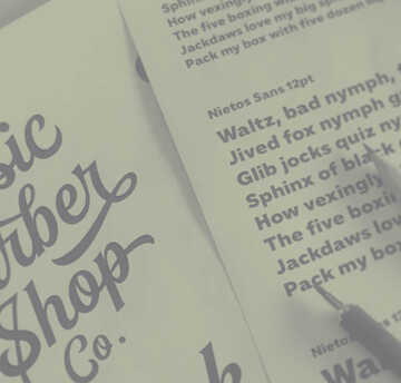
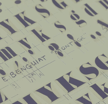
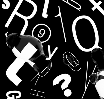
Font Legibility
Elizabeth Ann Clark, Chief Creative Officer at virtual reality studio, AEXLAB, talks about the power of VR in social contexts, some of her favorite design tools, and how her team came to select a student-designed typeface for the face of their flagship game.
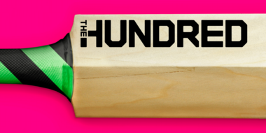
The England and Wales Cricket Board (ECB) have reimagined Cricket with the introduction of a new competition; ‘The Hundred’. Monotype collaborated with FutureBrand London to create a bold and confident typographic identity aimed at shifting perceptions to attract a wider audience to the game.

Makers of smart watches, wearables, medical devices, automotive dashboards and other resource-constrained devices no longer have to use low-quality bitmap fonts for their displays. The Monotype Spark Solution brings the benefits of scalable type and high-quality multilingual font display to the embedded environment - and it just got a major upgrade.
Creative Type Director, Phil Garnham, spoke with the Economist in May about the impact the pandemic has had on typography. With such an unprecedented year we’ve had, Phil uncovers how this period has evolved fonts to become friendlier to their audiences.

Modern retail brands find themselves in an era of unprecedented disruption. Here are five ways fonts can strengthen your brand and customer experience.
Let’s look at how design and typography can help keep brand sentiment strong while sending a message that assures your customers you get what’s going on.
Fonts are more than a pretty face. Underneath their polished surface is an intricate array of data and functionality that few people ever see. Yet this hidden world is integral to the reliability, performance and appearance of a font.
Learn how variable fonts can help brands looking to distinguish themselves in the modern marketplace.
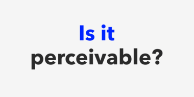
In this three-part series, we’ll show you how fonts can help your website follow the standards established by the Americans with Disabilities Act.
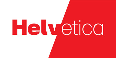
You can love it or hate it, use it for nearly anything or refuse to use it at all. But however you feel about Helvetica, no one can deny its place in society.

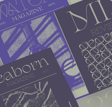
Fonts play an indispensable role in shaping your experience of published media, working in a deliberate way to communicate the information clearly and legibly.

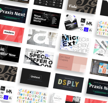
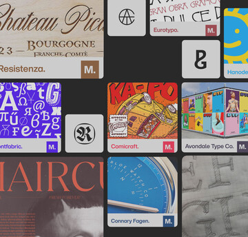
Choosing the right font for your next project is more than just an aesthetic decision. Brands have numerous factors to consider, from price to deadlines to the importance of being unique, all of which influence the selection process.

When screens get smaller, spacing gets tight, details get lost, and forms blend together. The resulting legibility issues can make for a frustrating reading experience. Here’s how to find the fonts that can fix it.
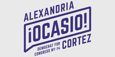
There’s more to a political campaign than ideology. Fonts and design play a crucial role in conveying a candidate’s personality (or lack thereof), perspective, and potential.
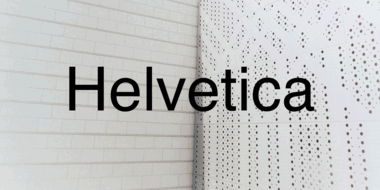
In many ways the idea that Helvetica is a ‘neutral’ typeface has become a self-fulfilling prophecy. That’s not to say it isn’t, but the neutrality narrative is only half the story.
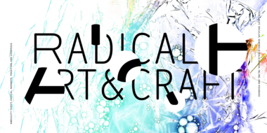
Ambiguity, from Charles Nix, offers a chance to pause for thought, question the state of affairs, and indulge in a little bit of enjoyable discomfort.

Juan Erquicia, Group Brand Manager at Santander, discusses the hurdles his brand faced heading into its rebrand, and how a custom font from Monotype helped solve those challenges.

Fonts play an important role in delivering a smooth experience to financial customers, and also help financial institutions keep up with evolving expectations.