Featured article.

Let’s look at some common font issues you might have already come across, and how Monotype Fonts can help you resolve them.
Let’s look at some common font issues you might have already come across, and how Monotype Fonts can help you resolve them.

Long gone are the days of zipping up folders of font files and sharing them across your organization, or even messier, embedding fonts in documents in the cloud in hopes that the design remains intact. We recently announced an expanded set of licensing rights which allows all employees within an organization to access Commercial Production Fonts in their desktop environments.

This week we’re welcoming Andrew Krivine, author and punk rock collector, alongside Michael Worthington, faculty at CalArts and co-founder of Counterspace. The creative duo is here to tell the tale of how they co-created the largest exhibition of punk and new wave graphics ever shown on the West Coast.

Over the past four years, we’ve been lucky to forge a reciprocal partnership with the Limerick School of Art & Design / TUS in Ireland. Both Creative Type Directors Tom Foley and Emilios Theofanous have now participated in workshops and modules at the leading fine art, design and creative media school. This year’s students were asked to write a message platform for one typeface and build a marketing plan and design assets to promote it in digital or print media.

Rebranding a business is not for the faint of heart. It’s an enormous operation that requires significant time and investment while offering the possibility of totally revitalizing a brand.

Legibility is a crucial consideration when trying to choose a font for your project. Here’s how to find a legible font that will be easy on the eyes for your readers and customers.

Launching a website or app? Your font choice is key to your success. Here’s how to assess the legibility, consistency, performance, and longevity of your font choice.

Find design inspiration in an age of information overload.

In this article, get a peek at recent and upcoming book releases in a variety of genres to get a sense of what typography styles are trending in publishing right now. This post is a guest piece from our friends at Reedsy, a website that connects authors with publishing professionals.

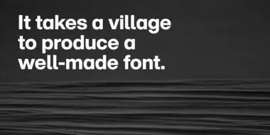
Today’s brands must keep up with a fast-paced digital world and navigate a “new normal” that’s still emerging from the worst of the pandemic. The last few years shifted everyone’s digital expectations, how brands operate, and in some cases, impacted their business models.
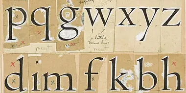
Fonts are more than a pretty face. Underneath their polished surface is an intricate array of data and functionality that few people ever see. Yet this hidden world is integral to the reliability, performance and appearance of a font.

We’ve long admired the incredible work of Fontsmith Founder Jason Smith and his team of designers, and we’re proud to welcome them to the Monotype family.

Out of all the thousands of fonts in the world, handwriting fonts are a category unto themselves. But even within that seemingly narrow niche, there is a range of styles that reflects the variations and subtle differences found in actual handwriting.
From alternates to X-height, this list of typography terms and definitions covers just about everything you’d want to know about fonts and typography.

“Typeface design is not an art. It’s a craft,” says Marco Ganz, the designer of Veto Sans. “People are familiar with letters. Letters have a purpose. Art has no purpose beyond making people think or wonder.”
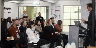
Our last Brand Talks event of the year focused on insights gained from the best in branding from 2019, and the emerging brand and design trends for 2020.
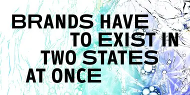
Modern brands are not static, stationary objects. Today’s brands need to be agile and adaptable, permanently poised to respond to shifts in consumer expectations, emerging technology, and opportunities in other regions and languages.

Learn how variable fonts can help brands looking to distinguish themselves in the modern marketplace.

Brand Talks featured speakers from leading global brands and agencies who discussed the primary factors influencing brand identity in a modern world.